Uploaded by Ninoyiya 
2736x3648 JPG 3.64 MBInterested in advertising on Derpibooru? Click here for information!

Help fund the $15 daily operational cost of Derpibooru - support us financially!
Description
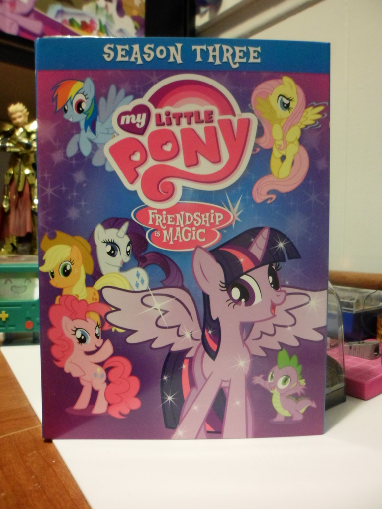
My Little Pony Season 3
Why is the cover art so bad?
Why is the cover art so bad?
Tags
+-SH safe2267138 +-SH applejack208001 +-SH fluttershy269071 +-SH pinkie pie265883 +-SH rainbow dash290758 +-SH rarity225791 +-SH spike95135 +-SH twilight sparkle371244 +-SH alicorn335806 +-SH pony1699656 +-SH g42126499 +-SH my little pony: friendship is magic267629 +-SH season 33532 +-SH adventure time1662 +-SH bmo47 +-SH butt wings432 +-SH dvd474 +-SH fate/stay night156 +-SH female1908575 +-SH gilgamesh41 +-SH male585661 +-SH mane six38929 +-SH mare805827 +-SH merchandise6388 +-SH twilight sparkle (alicorn)154832
Source
not provided yet
Loading...
Loading...


It is. $14.95.
The reverse side of the actual dvd cover is the map of Equestria, so that’s cool.
They probably just get a set number of vectors to work with. These sets literally are only sold online and virtually everyone buying them are bronies who don’t usually care about the cover art.
At least the gradient is a good color scheme.
Half the episodes, it better be half price.
Especially considering the cover art for the Season 1 & 2 DVD box sets.
El oh el jay kay