Uploaded by Mokona 
1920x1080 PNG 1.3 MB
Interested in advertising on Derpibooru? Click here for information!

Help fund the $15 daily operational cost of Derpibooru - support us financially!
Description
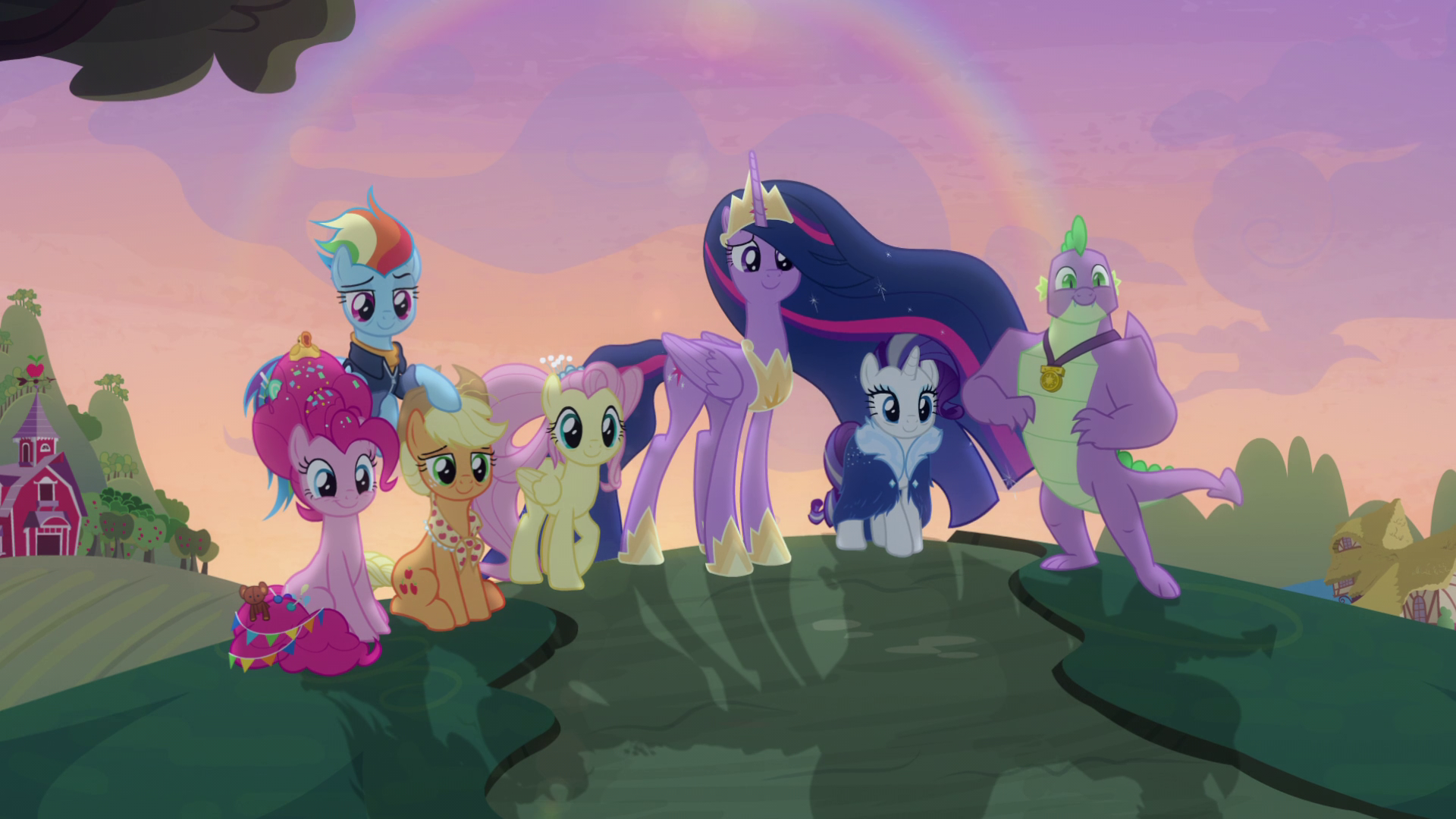
A pretty nice shot to end the series with, although I thought it would be a bit brighter
Tags
+-SH safe2234103 +-SH screencap300634 +-SH applejack205383 +-SH fluttershy265427 +-SH pinkie pie262361 +-SH rainbow dash286990 +-SH rarity222807 +-SH spike94048 +-SH twilight sparkle366627 +-SH alicorn328354 +-SH dragon89708 +-SH pony1664239 +-SH g42096339 +-SH the last problem8095 +-SH gigachad spike1320 +-SH mane seven8095 +-SH mane six38390 +-SH older42139 +-SH older applejack1111 +-SH older fluttershy1100 +-SH older pinkie pie1053 +-SH older rainbow dash1387 +-SH older rarity1042 +-SH older spike9516 +-SH older twilight4588 +-SH older twilight sparkle (alicorn)4065 +-SH princess twilight 2.03976 +-SH twilight sparkle (alicorn)153106 +-SH winged spike10503 +-SH wings240807
Source
not provided yet
Loading...
Loading...
Edited
I was speaking specifically about her design.
And you’re missing what I was getting at. I was saying they could have just implied Twilight always stayed the way she is, more or less as sm0ll Alicorn, and people would have accepted that just as easily at face value. Regardless of whether or not it’s actually more “canon” that she should eventually look almost exactly like Celestia, what I’m saying is this just looks weird to me.
It looks weird to me. I don’t like it. That’s….basically it. I’m not going to rage about it or anything, it’s not like I’m going to write death threats to the staff like the freaks on /MLP. I just don’t think this particular version of Twilight, the “Princess Twilight 2.0” will really catch on like her previous evolution did.
If I were in charge of her design I would have found a different way to express how she’s moved on and grown (either literally or metaphorically) over the years - there are lots of cool “final form” fan designs out there for example, including that popular one where she gets the cream swirl in her hair. I don’t remember the origin of that style that different artists use sometimes but it’s a nice idea.
They didn’t “literally turn her into Celestia”. Celestia didn’t have friends to help her rule. Just because the design is similar doesn’t mean the character is identical. Aging has always been a part of the FIM world. If alicorns never aged, then Flurry Heart would forever be a foal. Cadance changed appearance between the flashbacks of A Canterlot Wedding and her actual appearance in the episode.
A fictional world run by magic has very little rules, so frankly there’s no rule that says she HAS to look different in a thousand years. She could literally look like the smoll cute alicorn for the rest of eternity and that’d be just as plausible. She simply didn’t in canon because the writers chose the other direction, to literally turn her into Celestia as years go on.
As for the origin of this design, that doesn’t really make me like it better. I still think it’s a little too on-the-nose.
A few things. “smoll little cutie alicorn” wouldn’t last, as she was younger. As for turning into Celestia, this design seems to be paying homage to the alicorn Twilight that Lauren Faust drew, so personally I can live with it. And that extra accessory on AJ is Granny Smith’s scarf
Rarity’s mane isn’t dyed to have that silver stripe. Being a business pony, she likely has a lot of stress. If anything’s dyed, it’s the purple lol
Yeah Spike looks alright. Not quite his dream body but not terrible.
The thing is, they had to tell a story as quickly as possible. The story of where the mane 6 ended up. So there’s a lot of “show, not tell” in the final episode. That’s why the designs are a bit excessive. Not saying your criticism is invalid, just explaining.
I’m iffy on Rarity’s “final form” of dying her hair with a silver stripe. Interesting but still just changing something for the sake of changing it as far as I can tell.
Spike’s design I’m sort of okay with.
To be totally honest I think there’s a lot of things about the final that people are going to ignore. My personal fanon, for one, will exclude most of these designs.
And it’s not just because it’s new either - for me the transition from unicorn to alicorn for Twilight was pretty acceptable, I never agreed with any of the stupid rage about that from seasons ago. Just something about these “final forms” they end with don’t look right to me. Too flashy, they look more like special editions of some toys that Hasbro demanded so they can sell toys.

your current filter.I don’t get the joke?
Since when is Fluttershy a Pegasus??
Edited