Uploaded by Background Pony #1CB3
1911x1251 PNG 267 kB
Interested in advertising on Derpibooru? Click here for information!
Help fund the $15 daily operational cost of Derpibooru - support us financially!
Description
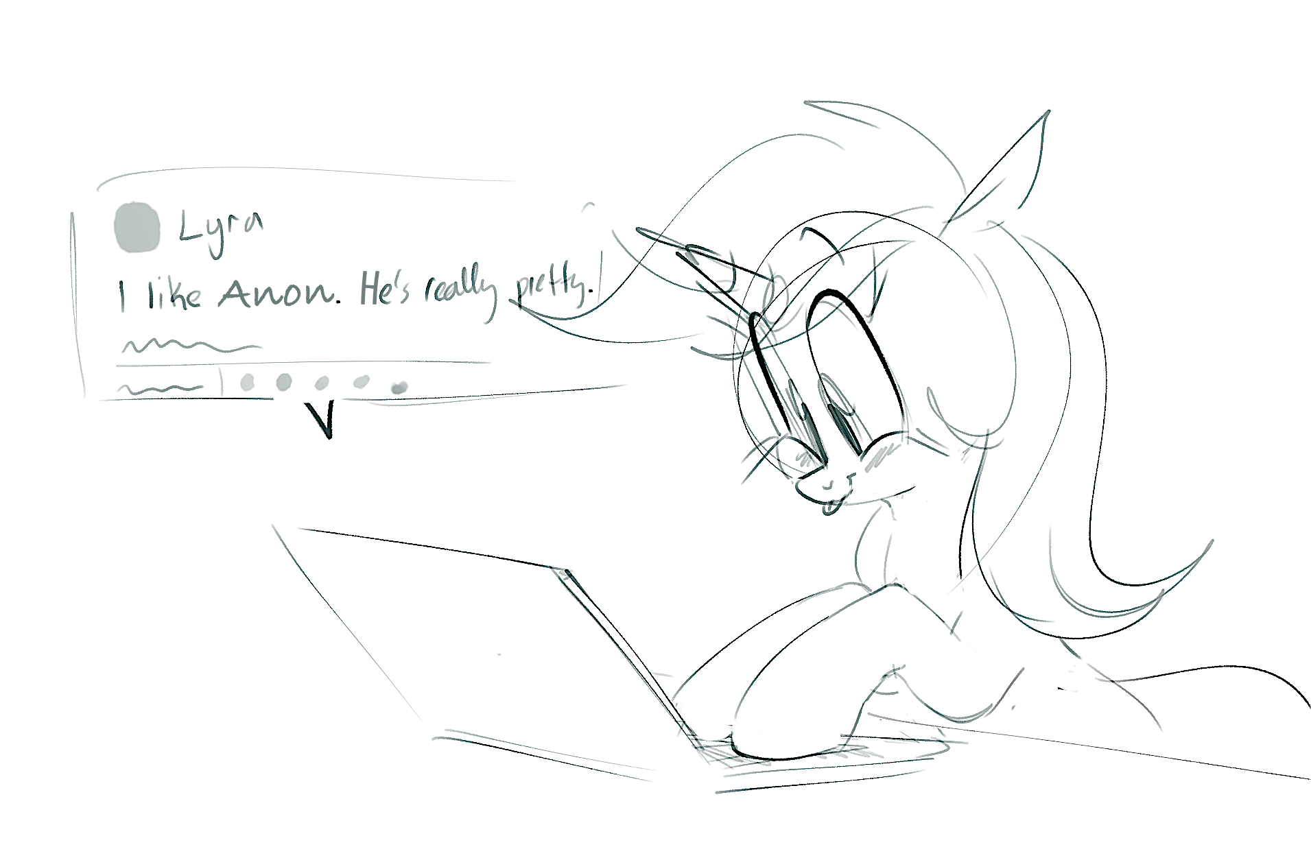
edit of >>2209396 with increased sharpness and fixed spelling.
Tags
+-SH safe2201934 +-SH artist:hattsy463 +-SH edit175626 +-SH lyra heartstrings34414 +-SH pony1632441 +-SH unicorn551717 +-SH g42057765 +-SH blushing280033 +-SH computer8323 +-SH cute269786 +-SH female1833973 +-SH implied anon1003 +-SH laptop computer3351 +-SH lyrabetes1786 +-SH mare761077 +-SH monochrome176740 +-SH simple background611136 +-SH solo1449093 +-SH text91613 +-SH tongue out150163 +-SH white background167050
Source
not provided yet
Loading...
Loading...
i see what you mean, i’ll try to have my sketches darker in the future
but as for lines, they generally aren’t worth the effort (for me, atleast), especially when my sketches always end up looking better anyways. i’d rather focus on improving my coloring skills than my lining skills, so i’ll probably start focusing on that. ’preciate it
It was done mostly to increase the contrast and make the drawing more visible. otherwise, your sketches tend to be quite lightly colored with thin lines, and the lines themselves aren’t very dark - more grey than black - so they tend to blend in with the plain white background thus making the whole sketch hard to see.
side note, your sketches are fantastic and they deserve to be finished more rather than leaving them in their skeletal unfinished state. even if you don’t want to color them, finished lines would be soooo much better.
it’s understandable if it’s not what you’re interested in doing, your pony art is great either way and I hope you keep up the awesome work. more ponies, please!
Edited
>changed the text
lol