Interested in advertising on Derpibooru? Click here for information!
Ministry of Image - Fanfiction Printing

Help fund the $15 daily operational cost of Derpibooru - support us financially!

Description

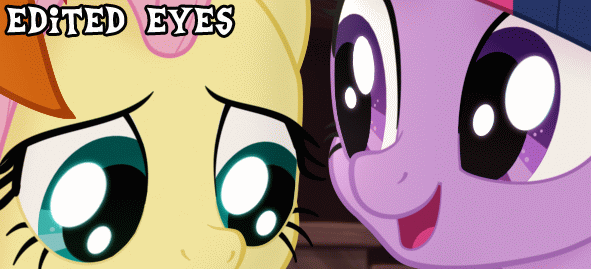
An edit and comparison of the eyes/eye shines from the movie, based on one of the recent released screenshots. I think the official artwork makes the eyes look dead/glazed over/have cataracts, so I modified them to a style I think gives them more life and just looks better. In my opinion. I changed A) the opacity of the eye shines/sheen to be fully white with a 50% transparent outer glow that matches the color of their iris and B) darkened the pupils by 65%
 
P.S. I’m really excited for the movie, this is just a little thing that has bugged me since I first saw the promo art.

Comments

Syntax quick reference: **bold** *italic* ||hide text|| `code` __underline__ ~~strike~~ ^sup^ %sub%

Detailed syntax guide

Hazy Skies

Aura Dust (AURAequine)
In the original one, having a sort of teal outline for the highlights makes sense for Fluttershy, but it looks strange on Twilight o~O
Shinkaku
Chaotic Little Trees - 1000+ images under their artist tag
Pixel Perfection - I still call her Lightning Bolt
Solar Supporter - Fought against the New Lunar Republic rebellion on the side of the Solar Deity (April Fools 2023).
Da Magicks! - Merited Fine Arts badge with only their own art
Fine Arts - Two hundred uploads with a score of over a hundred (Safe/Suggestive)
Non-Fungible Trixie -
Magnificence - Artist with 100+ Safe/Suggestive images with over 100 upvotes, and 5+ Questionable/Explicit images with over 350 upvotes
Perfect Pony Plot Provider - Uploader of 10+ images with 350 upvotes or more (Questionable/Explicit)
Hard Work - Merited Perfect Pony Plot Provider badge with only their own art
A Really Hyper Artist - 500+ images under their artist tag

Not...even...once...
I know we should focus on the edit, but all I hear when I look at this is Twilight saying, “Where is your god now?”
Ihhh
Duck - Likes to sockpuppet for drama
Duck - 1104243, just... 1104243
My Little Pony - 1992 Edition

<<<<<
Whether or not eyes look dead has a lot more to do with how they move and whether or not the pupils dilate then it does with how they reflect light
cheezedoodle
Roll for Initiative - For Patreon supporters
A Lovely Nightmare Night - Celebrated the 12th anniversary of MLP:FIM!
The Power of Love - Given to a publicly verified artist with an image under their artist’s tag that has reached 1000 upvotes
Princess of Love - Extra special version for those who participated in the Canterlot Wedding 10th anniversary event by contributing art.
Non-Fungible Trixie -
Thread Starter - OC Tag Description Requests
Friendship, Art, and Magic (2020) - Took part in the 2020 Community Collab
The Magic of Friendship Grows - For helping others attend the 2020 Community Collab
Dream Come True! - Participated in the MLP 9th Anniversary Event
Silver Bit -

Moderator
TagZombie: AC15, Atk +8
I’ve been using the traditional solid black pupils with 75% opacity white eye shines and I think it looks good.
 
I think it’s the fact that movie pupils aren’t solid black that makes them look somewhat ‘off’ to some people, like me.
 
Here’s a few examples of my version:  

 
Nobody has mentioned the eyes one way or another.
Background Pony #8998
@Zeb  
It wasn’t just the comments, it was the picture and the description. I wasn’t pleased of what they were saying about the eyes. Seriously, I don’t know why they’re going against the eyes, but I think the eyes are fine. They’re just complaining about little things going on towards MLP Movie, and I don’t like that. It’s really starting to make me feel nervous before I get to see it, and that’s not fair. Because I’ve waited so long to see this movie. I wanna be excited to see the movie. I wanna feel the excitement. And I just want to hear the excitement/hype for the movie as well. That’s all I need. Anyways, I completely understand what you mean. And you’re right. sighs sadly I’m sorry. I think I might go lay down for a while, so that way I can relax and calm down.
Zeb
Praise the Sun! - Derpi Supporter
My Little Pony - 1992 Edition
Friendship, Art, and Magic (2019) - Celebrated Derpibooru's seventh year anniversary with friends.
Economist -
Notoriously Divine Tagger - Consistently uploads images above and beyond the minimum tag requirements. And/or additionally, bringing over the original description from the source if the image has one. Does NOT apply to the uploader adding several to a dozen tags after originally uploading with minimum to bare tagging.
Perfect Pony Plot Provider - Uploader of 10+ images with 350 upvotes or more (Questionable/Explicit)
Equality - In our state, we do not stand out.
Friendship, Art, and Magic (2018) - Celebrated Derpibooru's six year anniversary with friends.
Cool Crow - "Caw!" An awesome tagger
Birthday Cake - Celebrated MLP's 7th birthday

Tag-Bot
@Background Pony #2C58  
All right dude, you seriously need to chill on this.  
If other people’s complaints are affecting you so much, you should probably take some time away from these images to get it out of your system.  
Or maybe just not reading the comments.  
I know it can be hard not to let negative opinions affect how you feel sometimes. But big long all-caps posts won’t help that.
 
Just take some time, don’t read the comments on these images. Let the negativity get out of your system.
Background Pony #0550
I prefer the unedited version. The edited version looks too bright compared in the movie style. If I were to make an edit, it’d be removing the blue-ish outline around the shines. I would like a version of this but with different levels of opacity for the shines. Maybe something a little brighter but not totally white would look better than both presented here. Ideally a “game” with a slider and blue outline toggle.
Background Pony #E9BD
The official ones look almost glazed over or foggy.  
I think the edited ones look better just because they look more like the ones from the show.