
Interested in advertising on Derpibooru? Click here for information!

Help fund the $15 daily operational cost of Derpibooru - support us financially!
Description
No description provided.
Help fund the $15 daily operational cost of Derpibooru - support us financially!
No description provided.
Oh god that undertale art. Why.
Yes, but people would much rather use their trigger words that make them feel bigger. I honestly think it’s denial of the fact that some people won’t like a thing and the idea that the only reason they don’t like it is because “Day wasist! How dar thy!” Is just pathetic, as if they can’t not like the thing. Hell I don’t like it when a white character is drawn as black or a black character drawn white. Why? Because-that- actually feels racist, as if you can’t accept the character as their natural color. Am I gonna call everyone who does like that racist? No. I’ll just go on with my day like a normal person.
And lest we forgot that people going “You only hate this because you’re racist” doesn’t exactly endear them to it. Rather the opposite happens, I tend to find.
Or it could be the fact people are tired of this kind of art being praised and told that it’s absolutely perfect. Or, the shippers not liking the poor ship, or the people who actually see poor art. But yes, there’s a possibility that there are racist. But in the same area there’s a possibility that it’s not. It’s ignorant to say the downvotes couldn’t possibly be because of poor artist which are a rampant problem on this site and in general.
¯*(ツ)*/¯ im not even pointing fingers specifically at anyone im just saying its ignorant to say the downvotes couldn’t possibly be because of racist bronies which are a rampant problem on this site and in general
Exposure, my friend. Seems quite a few people saw this. You had at least 57 people bother to vote, so make of that what you will.
and? ive seen worse art get better scores. -33 seems excessive for ‘bad art’ 🤔
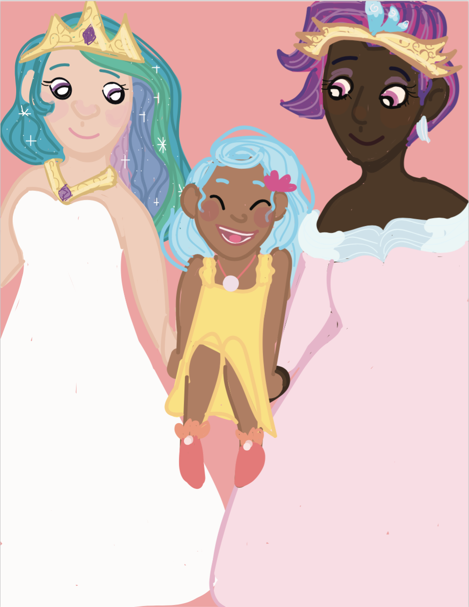
1.The lines are ridiculously messy, as is the coloring inside them.
2. Skystar’s dress looks like a slice of cheese and her legs look like they’re melting into It rather than scrunched up to her chest.
3. Celestia’s face makes her look like a knock-off Lilo and Stitch character.
4. Color bleed absolutely everywhere, especially on the arms.
5. The eyes are uneven.
6. Novo’s hair is a mess.
7. Skystar’s shoulders are disproportionate to each other.
That might explain the score. You know, just a tad.
Edited because: Spelling for the spelling god
honey it has nothing to do with the art
@FrustrationInExcelsis
There might be some of that going on, but I think a large amount of it is that this art style has a lot do to with a very specific Tumblr art style that tends to get some eyerolls.
For example:
Whether that was the artist’s intentions or if they even HAVE tumblr, I don’t know, but I think that pretty adequately explains a lot of it. The other part, as Meanlucario said, the art isn’t particularly stellar. It’s kind of cute, especially Skystar, but the messy lines and Celestia’s face… eh…
It not being porn also doesn’t help it.
I’ll grant you that art’s not stellar, but I’ve seen plenty of pictures with worse art and higher scores than this one.
I also know that people taking issue with characters not being drawn as white is something a recurring issue on this site, so I hope you’ll forgive some cynicism on my part.
@Coaldust
The art isn’t that good either.
I see. Now I get it.
For the same reason black depictions of characters are often voted down. Some people are racist dicks.
I’m so sorry.
It’s always shipping.
ALWAYS.