Uploaded by DragonicBladex 
1599x1601 PNG 1.95 MB
Interested in advertising on Derpibooru? Click here for information!

Help fund the $15 daily operational cost of Derpibooru - support us financially!
Description
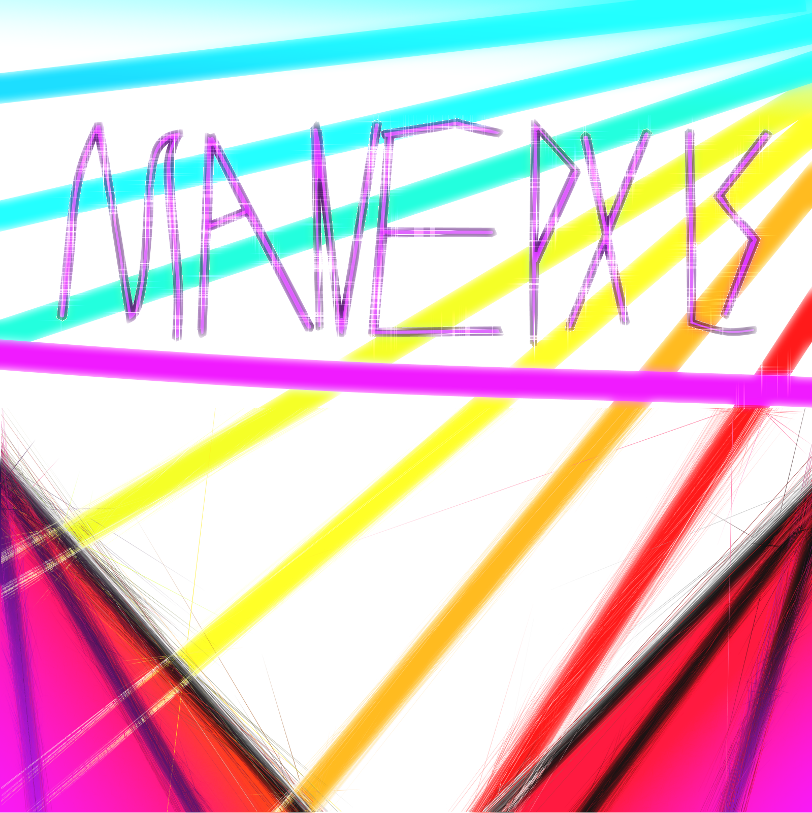
Hey guys! I spent a few hours on this and it was super fun :D. The coolest effect is the cobweb effect on the curtains so try to look for that cause I personally think it looks great.
EDIT: (If you’re wondering how this is mlp related, I made this logo for an mlp pxls faction, pxls being basically the same as r/place)
Probably the first piece of art I haven’t criticised myself extensively for so I’m happy :D.
EDIT: (If you’re wondering how this is mlp related, I made this logo for an mlp pxls faction, pxls being basically the same as r/place)
Probably the first piece of art I haven’t criticised myself extensively for so I’m happy :D.
Source
not provided yet
Evolve it. Draw it again and see how you can improve it. One thing is to use an actual font for the text, which will improve it. For a logo, you should consider having clean, sharp lines.
Yeah idk what to do with this one it’s just an absoloute mess rn but I can’t bring myself to request for it to be removed so…. rip.
Edited
I think the issue is that there isn’t much to an artwork. It’s some stripes with text on. A logo, sure, but not much for an artwork.
A faction for pxls.space which is basically r/place.