Interested in advertising on Derpibooru? Click here for information!
My Little Ties crafts shop

Help fund the $15 daily operational cost of Derpibooru - support us financially!
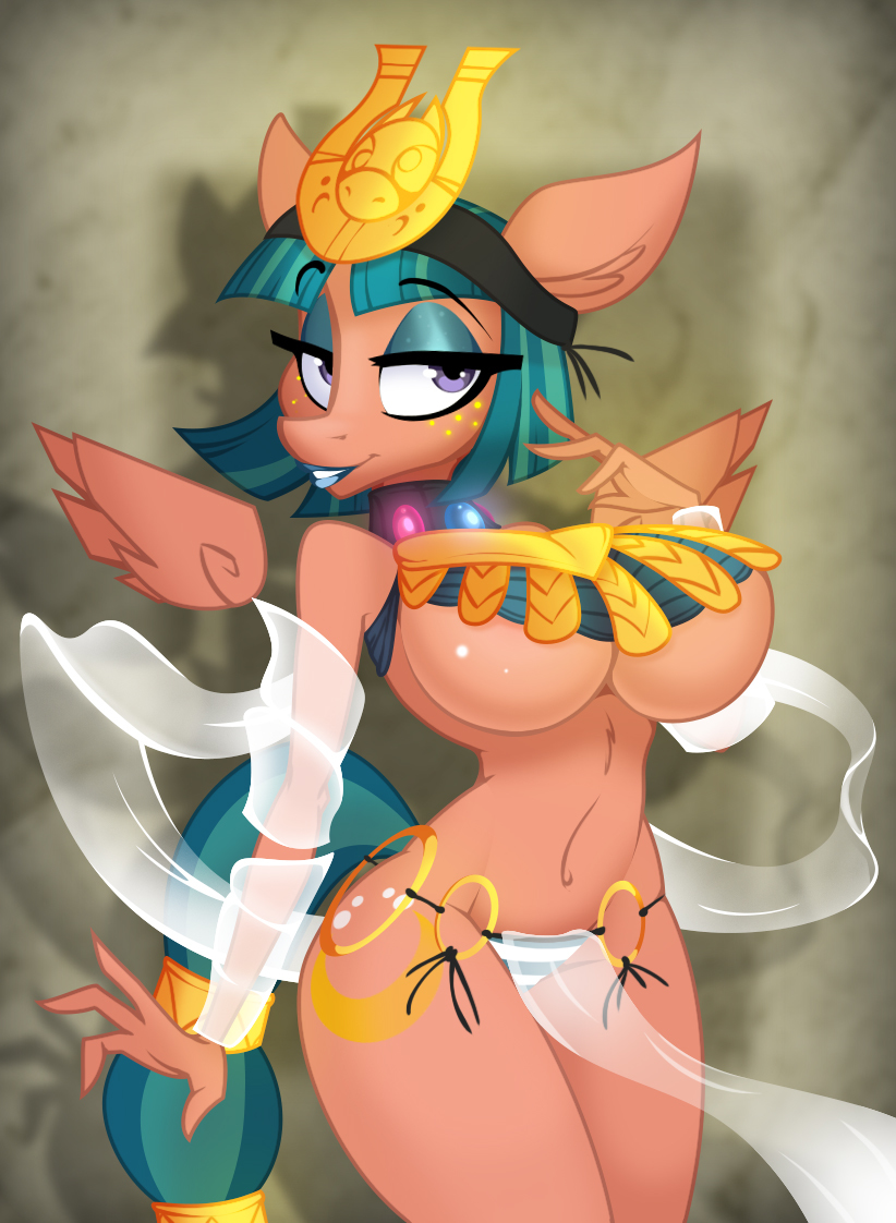
Description

Let it be known that when I ask for critique up front, I listen to it.
 
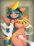
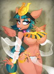
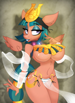
So the far right face there is the most recently redone one, with all the critique I got about the second one in mind.
 
>Original >Redone Face >Redone Face TWO  

suggestive193772 artist:lil miss jay2612 somnambula2445 pegasus514757 anthro369613 full service playing cards292 g42068595 bedroom eyes84512 belly dancer1150 breasts402032 busty somnambula269 clothes652436 curvy10349 cutie mark51422 egyptian1962 eyeshadow32067 female1848896 floating wings1679 freckles46048 hourglass figure3249 lipstick17371 loincloth1797 looking at you269196 makeup42834 menace21 no difference1 queen's blade40 see-through7760 smiling412759 solo1459176 solo female240381 stupid sexy somnambula57 underboob5236 underwear80787 wings234848

Comments

Syntax quick reference: **bold** *italic* ||hide text|| `code` __underline__ ~~strike~~ ^sup^ %sub%

Detailed syntax guide

Background Pony #D306
Oh wow, it’s even worse. Jokes aside, this does look better than the previous version to me. But it doesn’t fix my main issue with it, which is how long the face looks, and actually makes that one particular bit worse. Still overall better, but I’ve always liked my anthros to be a little more human in the face department as well. Still, your art, your choice. Personally I’d take a shorter muzzle and a less pointy nose, but I know some people feel the opposite way.
Queen Size

Butthorse
While I do prefer the original first version over design two… design three is an improvement over two. It’s a lot smoother and a lot less ‘horse face’ than design two.  
However what appealed to the original design, is that the face looked more similar to ‘show style’ and you don’t see that a lot in anthro images at times. It’s what made it really good and highly liked.  
But if we’re going for a change of pace to update your own personal style, design three is far better than two, and feels like it’s close to how you used to do it in the original, while still doing something unique to you.  
It still does look more like a duck bill- but not in the same sense that it’s bad. It more so looks like an actual snout. In design two it looked like a square block and reminded me of horse face in all the wrong ways. I’ll take duck face over horse face- duck face is far better!  
While I personally prefer the original designs rounded look that resembled show style shapes, I do approve of trying something new with ones art and experimenting with something new to keep things fresh.
LanceOmikron
Lunar Supporter - Helped forge New Lunar Republic's freedom in the face of the Solar Empire's oppressive tyrannical regime (April Fools 2023).
Non-Fungible Trixie -
Wallet After Summer Sale -
Artist -
Magical Inkwell - Wrote MLP fanfiction consisting of at least around 1.5k words, and has a verified link to the platform of their choice
Not a Llama - Happy April Fools Day!

Because COLORING!!
Hey, that’s definitely an improvement. The softer expression is a much closer match to the look of the original. ‘3’
 
I’m digging the narrower snout, too. It’s a good fit for the “springiness” of your style.
Tide Hunter
Non-Fungible Trixie -
Wallet After Summer Sale -
Birthday Cake - Celebrated MLP's 7th birthday
Artist -

Tag the genders
This seems to match the tone of the original, in a way which I think would please any fans of the original version more than the first remake, aside from those which just don’t have a preference for horsey faces.
Furryfurryrabbit

Her nose turns up a bit more in this, looks like. It’s almost like a duck bill. This one seems a bit more cartoony, which isn’t quite my thing, but it does match the rest of your style pretty well. Not really sure if making the eyes bigger is the answer.
 
But I know basically nothing about art, so I’m not exactly the best judge.