Rainbow Rocks 10th Anniversary - Let's celebrate the 10th anniversary of Rainbow Rocks with an art event! Here
Interested in advertising on Derpibooru? Click here for information!
My Little Ties crafts shop

Help fund the $15 daily operational cost of Derpibooru - support us financially!

Description

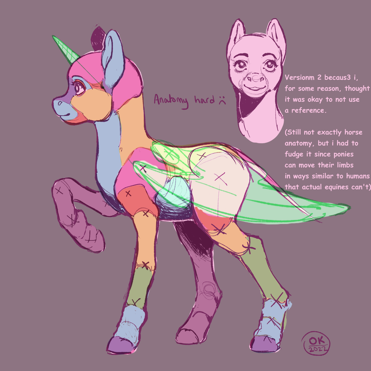
I looked at an actual horse skeleton and when I compared it to this. oh no. bütcherëde lïmbestm
I’d say the surgery was okay

safe2226599 artist:socialgutbrain77723 derpibooru exclusive41981 edit177971 editor:socialgutbrain7771 oc974965 oc:any pony72 pony1656605 ambiguous gender2670 anatomy514 anatomy guide78 any species608 blank flank10361 colorful800 comic sans1585 hoers4866 misspelling3256 practice drawing194 semi-realistic187 solo1471512 updated556 updated image85
Source

Comments

Syntax quick reference: **bold** *italic* ||hide text|| `code` __underline__ ~~strike~~ ^sup^ %sub%

Detailed syntax guide

saby
Magical Inkwell - Untitled ancient Pegasopolis vignette
Pixel Perfection - I still call her Lightning Bolt
Solar Supporter - Fought against the New Lunar Republic rebellion on the side of the Solar Deity (April Fools 2023).
An Artist Who Rocks - 100+ images under their artist tag
King Sombra - Celebrated the 10th anniversary of The Crystal Empire!
A Lovely Nightmare Night - Celebrated the 12th anniversary of MLP:FIM!
A Perfectly Normal Pony - Red is Sprout, yellow is Hitch, you are a lout, and also a bitch.
Speaking Fancy - Badge given to members that help with translations
Tree of Harmony - Drew someone's OC for the 2022 Community Collab
Elements of Harmony - Had an OC in the 2022 Community Collab

Moderator
Anti Fun Officer
It’s better for sure. Some notes (I don’t mean to rant, just explain why these details matter):
  • The back of the skull is too large, comes too far down, this makes the skull-spine joint work difficult and uncanny to work with. It is an important joint for many poses. On a horse, the joint is located at the top, very close to where the ears are. What looks likemore skull behind the ears is actually the topmost curve of the cervical spine. I’m aware that FiM makes it sometimes look like a full-backed human-like cranium, but that’s just on upright poses. When they gallop, for an example, their necks show the curved topline that one would expect from a fully equine neck/head arrangement. Overall FiM follows equine anatomy markedly close, but it’s easy to not see that because all the fiddly parts are hidden inside such simplified shapes. Cheating for animation’s sake, and cartoon physics are used sparingly. Of course, carton physics can apply even when the artist is mindful of the underlying anatomy. In fact, keeping faithful to anatomy outside of cartoony moments is what makes the cartoony moments stand out and register properly. Do NOT get me started on why cartooniness doesn’t discredit real-based anatomy and structure lol.
  • The shoulder blade is short and too wide. The width isn’t that much of a big deal if you don’t plan to show any shoulder detail on a picture. In my opinion, it’s an important landmark in an equine’s anatomy and omitting it while showing detailed joints in the legs etc. makes the torso look loke a potato. The length is much more important though, since the shoulder articulates in a circa 45 degree range, and affects how the foreleg joins the torso, of course. Without a more or less correct shoulderblade, posing the forehand will always be somewhat guesswork, and may result in awkward poses. The top of the scapula should be touching the sides of the withers, not quite reaching the height of the highest spinal processes.
  • For the amount of neck and leg this pony has, I would like to see the head and body a bit longer—or inversely, for the short head and body, the neck and legs could stand to be a bit shorter. The proportions now are very FiM, but since the the shapes are much more realistic, the proportions make it look… off.
  • To pose the neck with any degree of refinement, one should be aware of the curve of the cervical spine. I’m not sure what the blue and orange areas of the neck stand for. If it’s supposed to approximate where the main masses of muscle go, the line between the colours should curve from behind the jaw towards the middle of the chest, creating two roughly triangular shapes, one large with its base against the shoulder and tip behind the ear / at the poll, one small with its base against the bottom of the jaw and tip in the middle of the upper chest.
  • The proportions of the foreleg look good, the hindleg could stand to have a shorter cannon and a longer gaskin. The thigh may also be a bit overlong, it would be a great thigh on a realistically rendered sporthorse, but looks off in an otherwise stylised figure.
  • Ok I think I know this is not supposed to be a mechanic model of pony anatomy, it looks more like a component analysis. Maybe you already know this. For practical purposes, especially any poses that involve articulating hind limbs, one should be aware that the point of articulation, the joint interface, is located in the “bulge” of the hock quite a ways below the X on your drawing. The point of the hock is only a bony protrusion that anchors tendons and muscles, directly analogous to the human heel. I make no claims about my human feet being any good, but at least they’re much better than before I realised I needed to get the hard anatomy fidured out before trying to make a silhouette that includes the soft anatomy.