Uploaded by Masem 

 - Took part in the 2020 Community Collab")
 - Celebrated Derpibooru's seventh year anniversary with friends")
")
 - Celebrated Derpibooru's six year anniversary with friends.")


900x1384 JPG 263 kB
Interested in advertising on Derpibooru? Click here for information!

Help fund the $15 daily operational cost of Derpibooru - support us financially!
Description
No description provided.
Tags
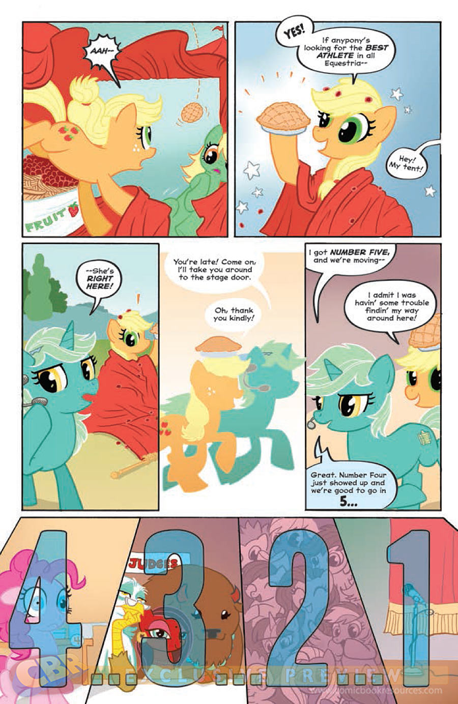
+-SH safe2234880 +-SH artist:carla speed mcneil45 +-SH idw21661 +-SH official comic6414 +-SH apple bloom61468 +-SH applejack205451 +-SH big angie8 +-SH flitter3429 +-SH fluttershy265531 +-SH pinkie pie262471 +-SH rainbow dash287072 +-SH rarity222894 +-SH sangria sizzle16 +-SH scootaloo59917 +-SH spike94065 +-SH twilight sparkle366767 +-SH vermouth roux13 +-SH bison930 +-SH buffalo1086 +-SH earth pony530741 +-SH griffon37967 +-SH pony1665031 +-SH unicorn566537 +-SH friends forever #150 +-SH g42097367 +-SH my little pony: friends forever1764 +-SH spoiler:comic13483 +-SH bindi81 +-SH idw advertisement594 +-SH offscreen character55593 +-SH preview2247
Loading...
Loading...
Briefly, yes; see the source link.
Oh, I have no idea how much we’ll see of her.
Just that when it comes to having to vector OCs, deep/crimsom red is usually the first sign of a Donut Steel character.
Huh. Well, now that she’s (comic) canon I’d rather see more art and stories about her than have her written off as “bad”. (Same as with Big Macintosh, Cadance and Sombra.)
Excessive use of crimsom red, one of the mono colors for good OC design
Why bad?
I’d love to read the story of how those three came to be judges in a town where five years ago ponies had never seen a griffon, panicked at the sight of a zebra and thought of buffalo as inconvenient wildlife.
A confirmed case of non-Celestian religion would certainly be interesting, but from what I gather from Wikipedia a bindi can be a secular symbol or simply “a cosmetic mark used to enhance beauty”.
That or a bad OC :)
“Come to Applejack, little pie.”
What I see:
“Come to Applejack, little Pie.”
Well obviously, #2 has the award winning writer of Princeless, Jeremy Whitley, writing it. I just hope that Tony Fleecs sticks to inking his lines like he did for the annual instead of coloring the lines like he did for the RD and Fluttershy issues of the micro series. The annual looked so much better with that small change.
Then #3 is being done by one of my favorite writers for the MLP books, just behind Heather Nuhfer, Ted Anderson.
She’ll like everything. What a shock.
@Fortune
All of them sound interesting, but this one seems okay.