Uploaded by Wesley Foxx  - Celebrated Derpibooru's six year anniversary with friends.")


 - Celebrated Derpibooru's five year anniversary with friends.")


941x303 PNG 48 kB
Interested in advertising on Derpibooru? Click here for information!

Help fund the $15 daily operational cost of Derpibooru - support us financially!
Description
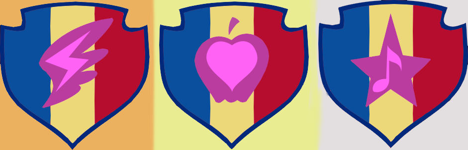
An alternate recoloring of their marks, using the colors from the CMC logo and cape rather than random, CMC-unrelated bullshit or meshing everything into a solid background.
Source
not provided yet
Chad and Romania wont work completely - they don’t have the coat of arms on them.
Also, Bosnian flag has no red colour.
Or Andorra, Chad, or Romania. Or if you arrange them differently, Colombia and Ecuador. Or if you lighten the yellow to white, Bosnia, France, Luxembourg, the Netherlands, Russia, Serbia, Slovakia/Slovenia and Yugoslavia.
Common flag colors, like I already said.
The only problem I have with this is that the CMCs’ mane colors are too close to one another’s: red, pink, and purple. They should’ve used more contrasting colors. For example, their eye colors (Orange, Green, and Purple) would’ve worked much better.
Other peoples’ recolorings have been unrelated. I was already aware that they matched their mane colors originally, along with the wing/fruit/star representing pegasi/earth ponies/unicorns and the inner symbols reflecting their individual talents.
@Background Pony #6969
They’re common flag colors. Its pretty much unavoidable.
That Background Pony number though.
EG: An apple on a shield of white and orange or suchlike.
This.
Take a look at the marks.

your current filter.Now take a look at the mane colors of the CMC

your current filter.Notice some similarity there?
Yeah, the cape colors would have been cool.
If you weren’t saying that the originals were unrelated to the CMC, then I’m sorry, but I did feel the need to point that out to those who may have missed it.