
Interested in advertising on Derpibooru? Click here for information!

Help fund the $15 daily operational cost of Derpibooru - support us financially!
Description
Artist’s Description:
Imgur link because tumblr makes it damn small:
http://i.imgur.com/7nksNF1.png
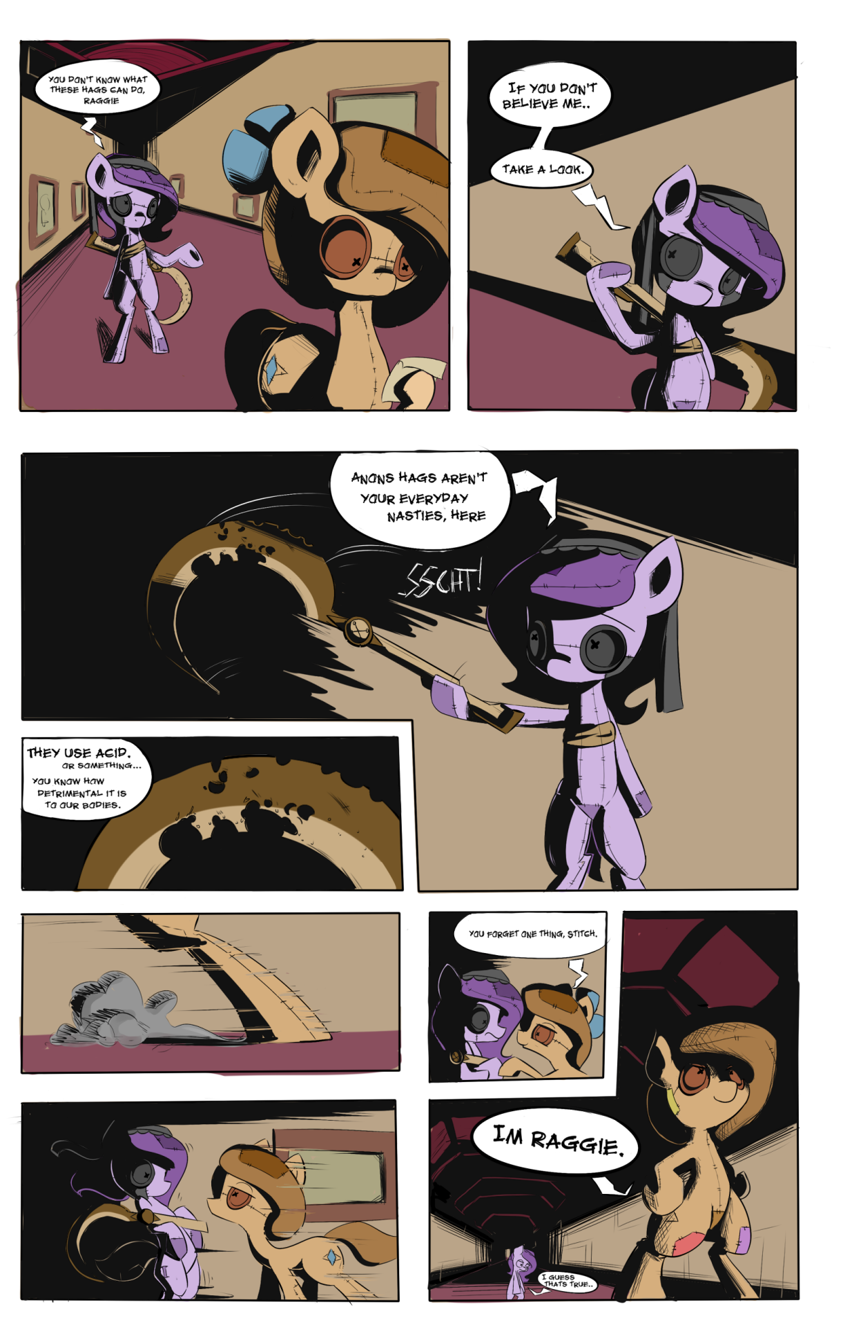
This isnt a real part of Hagwarders, its just a test page for practise, to try and work out shading/colour/composition. This is my first attempt at doing a comic so its full of mistakes.
If any professionals/experienced comic book artists out there happen to follow my tumblr, id be grateful for any books/guide recommendations or personal advice.
Imgur link because tumblr makes it damn small:
http://i.imgur.com/7nksNF1.png
This isnt a real part of Hagwarders, its just a test page for practise, to try and work out shading/colour/composition. This is my first attempt at doing a comic so its full of mistakes.
If any professionals/experienced comic book artists out there happen to follow my tumblr, id be grateful for any books/guide recommendations or personal advice.
Well, I was thinking that the background should be darker / blurrier / less saturated than the characters. And I wouldn’t dare say that’s a “must”, more of a suggestion :)
Another alternative would be to thicken (slightly) the outlines used for the ponies & props and remove the outlines used for the backgrounds.
Like I said before, re-examine some other comics. See how they handle this.
Interesting, so my characters should be more saturated than the background? I didn’t even think. Thanks man.
I’d recommend a little more differentiation between the backgrounds and your characters. Some simple ways to do that would be to darken the background colors or de-saturate the colors. As it is now, the tan walls and red/burgundy ceilings/carpet are fairly similar to your characters’ color palettes.
I recommend re-reading your favorite comic book artists, to see how they handle situations like this.
We love you, Raggie :)
I didnt explain that very well.
Non-artists opinions are just as important at an artists, because non-artists can tell me what the worst mistakes are (whereas artists will notice every little mistake)
Thanks for the tips man. The fact you’re not an artist is a good thing i think, because most people who im making the comic for aren’t artists either, so i can get an opinion from someone who will notice glaring mistakes. If someone with little artist knowledge can notice something wrong with the comic, that means im not doing my work right.
I agree on that lower panel. Ill keep that in mind for next time.
Poor Stitch! Her Sickle’s all corroded! D=
Speaking as someone who ISN’T an artist in any capacity:
I like the heavy shadows here. It gives the feeling of [Trying to find the right words here] Grim, despair, oppressiveness, and a more serious tone in general.
I was a bit iffy on the lower left panel. With such deep black on one side of Stitch and then it’s nigh on completely gone on the other side of her. But then I got to thinking on it. And it could work as sort of a visual metaphor for Raggie dispelling of the darkness with her mere presence~
In the close up panels with her and Stitch she almost appears to be the source of light.
I hope you develop a style you feel comfortable with soon. Really looking forward to seeing more of this~ =D