Uploaded by Sehad 

831x1014 JPG 179 kB
Interested in advertising on Derpibooru? Click here for information!

Help fund the $15 daily operational cost of Derpibooru - support us financially!
Description
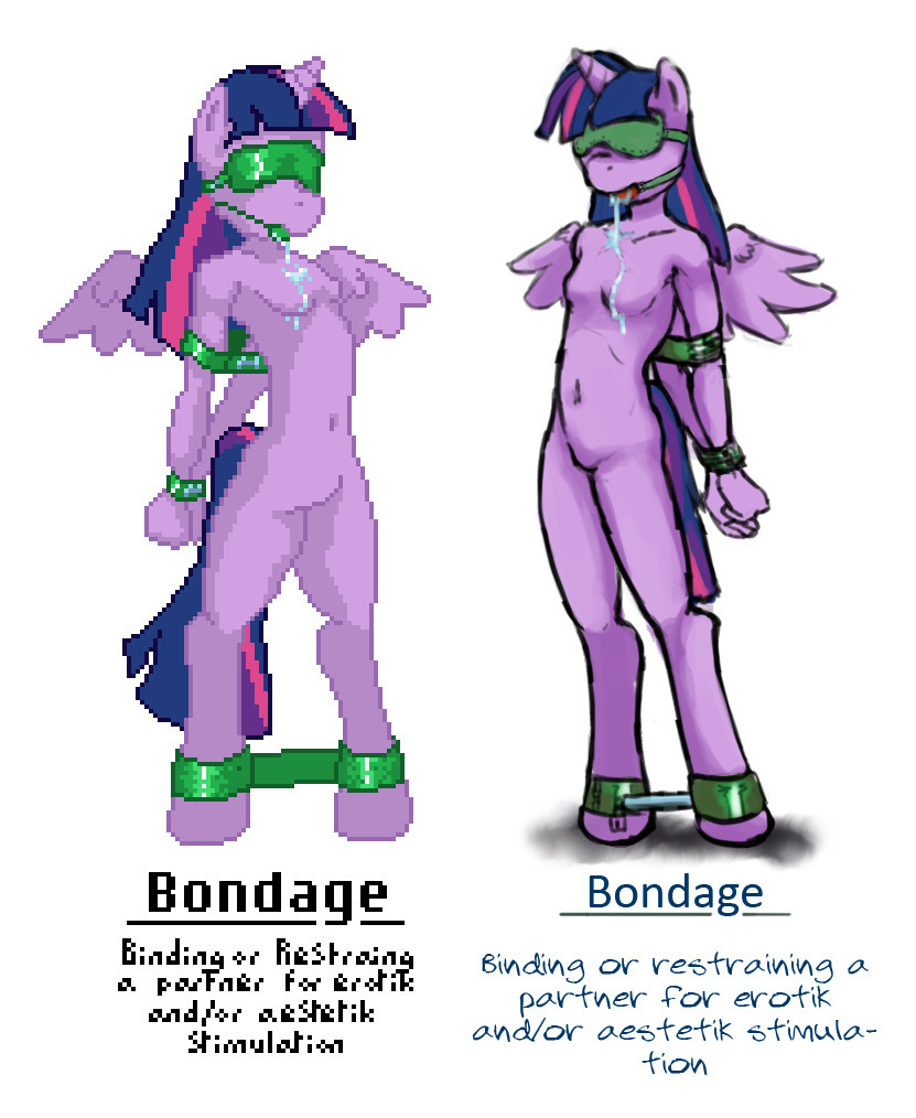
So, a remake on one of the old images from the big book. Now the question is, which style do you guys prefer? Pleas leave a comment on which you like the best (this for future images,,, yes, the pervert is back!!)
The other piece adds depth and dimension and for more straight up porn images I think that’s obviously going to add the detail people want.
Actually, for me it takes about 8-10 times longer if not more to make a pixel art picture, for example, for the time it took me to post the last post, I have manage to now draw 2 new pictures (they will be uploaded soon here _) But if I would have made them in pixel art, then I most likely would just have finished with the flat coloring of the first picture (and still not been done (and that asuming I manage to work fast which I most likely would have not Z_z) ((course Im heading for bed )) ((( 2 in the mornign <3)))
Ah? Pixel art takes longer? :j
And with the knee bending, I hope the new things will be satesfactory as well
Holy crap that’s so broken xD
@Whatsapokemon
Glad I could help :)
That’s actually a perfect example of where the knees are, nice find. I’ll keep that for future reference.

your current filter.Fair enough.
I like that sort of leg anatomy more too.
@Whatsapokemon
>I think more often than not it is a mistake. You should always know the rules before you decide to break them.
Alright, now I can see where you’re coming from. And I’d agree that that makes sense.
@stargrazer
Sometimes. But it depends on the animators and importance of the character in the shot. I mean earlier animations had some pretty funky leg bending:

your current filter.Probably because she was in the background and fully animating that part (with dem fancy shoes) was faster this way than with an actual jointed leg rig.
Edited
They kind of do bend like that:

your current filter.You can clearly see her knee there.
Yea, that was pritty much what I based the art on to begin with, though I must say I rather prefer the version myself that Whatsapokemon draw in the earliest post. @Whatsapokemon
Though I must say, the last one does not really fitt that well, as when animated the leg does not bend where you have pointed at during the show, though, before I say to much I will take the libery when time given to look that statment up more closely. @Whatsapokemon
Also, Love that not only has thees pictures led to deep discusions of poletics, religion, sexual preferences, the show their beased on and the internet as a whole but now also include art tutorials!
I feel that I have somehow acheved something here guys! _
I think more often than not it is a mistake. You should always know the rules before you decide to break them. Some people try to justify not knowing the rules by hiding behind “It’s my style”. But something should always look anatomically correct, even if you’re breaking rules.
For example in a more chibi style you can get away with it because the entire anatomy is simplified. But when you have a less stylised image that has incorrect anatomy then it’s most likely to be because of a lack of knowledge rather than a choice (and even if it was a choice then it was a bad choice).
The official style of the hind legs is a little misleading because of the stylisation, but it actually has good anatomy. There is a pretty fair distance between the knee and heel. I think people are mislead because they deconstruct the legs like this:
which is incorrect. The bone structure is actually more like this:
However, the way the flesh is drawn over the top makes it look like the knee is in a different place, or even that there’s only one joint at that point. It’s a problem with analysing the style, not a result of the style itself.
Edited
>Lacking that hock section between the knee and heel is a really common mistake I see from a lot of artists, and I feel the need to correct it whenever I can.
But it isn’t necessarily a mistake. It could be a clear decision on the part of the artist to simply draw legs in that manor. I mean, if we look at a screencap from the show:

your current filter.You’ll notice that the leg doesn’t look like it’s leaving a lot of space for the shin/calf. Fan artists might take the same liberties as they see fit.
Well my point was that it’s neither animal or human. On both of them there is a longer distance between the heel and the knee. This is known as the ‘calf’ or ‘hock’ depending on the creature. When I say that the joints are almost identical between human and animal legs I really mean it, since both are evolved from the same basic structure.
(Please excuse the rough scribbles)
Lacking that hock section between the knee and heel is a really common mistake I see from a lot of artists, and I feel the need to correct it whenever I can. I’ve seen some otherwise amazing artists make this small (but quite bad) anatomical mistake.
Edited
I can agree with the part about the hips, but the suggestion for the leg anatomy really seems like a stylistic one. Some people draw anthros with fully animal legs (short shins, long thighs/feet), others draw them more human (using the style you’ve indicated). How an artist chooses to meld those two different camps is really up to their personal preferences.
Edited
Whow, nice (shows me for trying to draw without my references with me Z_z) But as someone noted earlier, I will try to have the legs right till next time. Also, the nuzle part is always the one I have the largest issue with as I’m never happy with it however I draw it, but once again, references is key.
Will have a look through and hopefully get around to have some nice new art out soon if nothing else-
However I think in this particular picture there’s a few issues with her hip, and also her legs.
There looks like some kind of concave region just where her hip is that I’m not sure about. I don’t think it should go inwards like that there. It looks a bit like the leg is a separate thing, but the muscles connect the butt to the leg, ya know?
Also the knee and heel are too close together on the leg. Remember, the joints on an animal leg are virtually identical to those on a human leg. Anthros and ponies have knees and heels too. I suggest lengthening that ‘hock’ section so it doesn’t look like it’s not there.
Regarding art styles,
I prefer the new non-pixel style; I liked the old pixel style, especially for its uniqueness, but the new stlye looks cleaner/nice to me.
I also like the painted style, and the new font. It helps give the impression that the images are pictures in a book.
You could always try to find someone who might be willing to check your spelling for you before you upload, I’m sure someone would do it for you.
As of now it will most likely be that I keep the old style then, but update the smaller text when I upload to some actual font (both to make it more readable and also easier to spell check as that is still commented on quite a lot.) ((But what to be expected from a dyslectic with a non functioning spell checker.)
Also, on that note, quite interesting to see how many actually read the description, will try to be more informative and use that space from now on I guess.
Not that I plan on discarding the updated version either, but I rather make a redraw later then of the pictures and make a combined (HD book) or something with little more detail and such, perhaps backgrounds as well. We see how it goes.
@Gyroido
As said before, Always open for new ideas, just post them as a comment or send direct PM, I will add it to the to-do-list
@Barhandar
Will keep it in mind as I do the next piece, I can agree that I have sacrificed the actual autonomy of anthro-horse quite a lot in thees pictures, though the source/original art is somewhat closer to this on it’s own, though I suppose that is mostly due to the “chibification” of actual horse autonomy that is to blame for this.