Uploaded by Truffle 
 - Celebrated Derpibooru's six year anniversary with friends.")


 - Celebrated Derpibooru's five year anniversary with friends.")

2200x1700 PNG 717 kB
Interested in advertising on Derpibooru? Click here for information!

Help fund the $15 daily operational cost of Derpibooru - support us financially!
Description
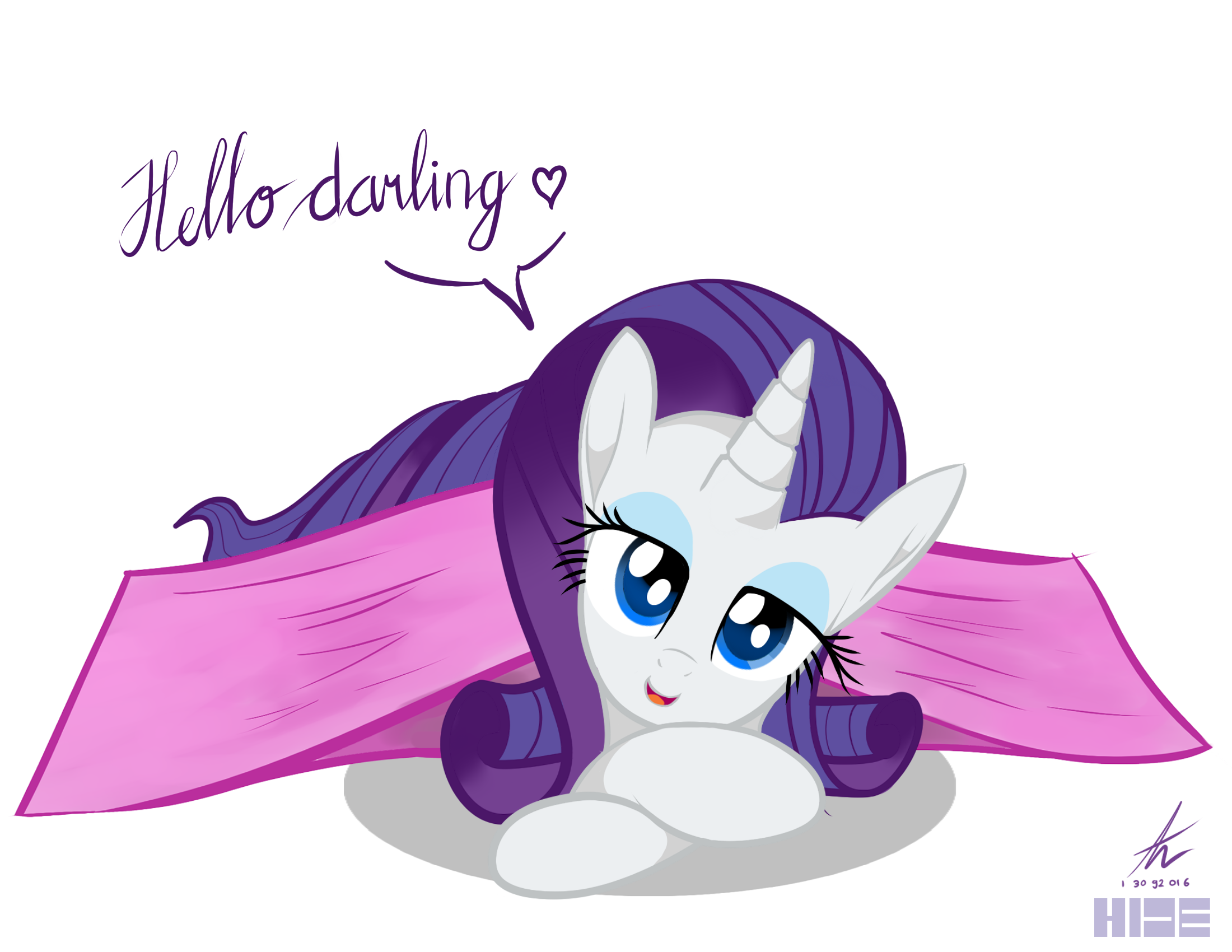
Part 3 of 5 from collaborative with HIDE.
Kind of failed with this one.
Kind of failed with this one.
No problem friend.
I honestly think this is great for something you drew without a reference.
But still, you’re welcome! And again, sorry for the wall of text. :P
@Manual_Monaro
Edited
>so much long text, so read.
Yeah, you’re right, aside from the blanket I also did wrong with her mane. At half way I draw her, I know her mane between her ears and horn kinda weird (especially right side). I did fix it twice but it got worse from my opinion.
So without reference (Like the two pic you linked to me) I just draw it from what I can remember. I learned my mistake, I will try to do it better next time.
For the head, it does look stupid for me. I want to make an oval head to compensate and match her mane (but failed). For ears I see what you are talking about but for me I still like it.
Yeah I’m not clearly a perfect artist but I really appreciate your time to nitpicked my drawing and told me how to make it better. Thank you so much, It is a great drawing after all.
There’s also the fact that it looks very rectangular and rigid, rather than appearing like the material is loose and ‘flows’ down to and along the ground (bit hard for me to explain, sorry). In fact, as it looks now, it’s as if there’s two heavy weights placed at each end of blanket, causing it ‘tense up’.
As for Rarity, I still think you drew her very well. I think a big part of what makes her look ‘off’ might be her mane and how you’ve drawn the head itself. The line for the top of her head - between the ear and the horn - doesn’t feel like it follows on from the line coming up the left side of her face. I also think maybe you drew it too far ‘up’, so it makes her look like she has a large forehead.
And for the mane, it’s kind of hard for me to explain, but have a look at some other images that use a similar angle to get a reference for how you might’ve drawn it differently (E.g. >>1100842, >>785618, focus on where the mane comes out of her head behind the horn and then curls out). Regardless, Rarity’s mane is notorious for being a pain to draw, so don’t stress too much about it! It’s mainly the part on the very top of her head that looks odd, the rest of her mane looks great (and I notice you tend to exaggerate the size of the mane, which is perfectly fine, I do it too!).
The only other thing I can think of is that the ears appear a little inconsistent, though it could be argued they look different because they’re pointing in slightly different directions. I do feel like they’re vertically misaligned though.
…I know that was a lot of words, sorry. Honestly, I kind of think that’s all nitpicking, so don’t take it to mean that it’s a bad drawing, not at all! This picture is still very nice and I think you’ve done a great job!
Thank you.
Well, I don’t know how to explain, How I drew the blanket and Rarity just seem doesn’t fit for me.
I did see it as a good drawing but hear it from somepony else is so great.