Uploaded by Theophylaktos Kallimykteres 
800x800 PNG 463 kB
Interested in advertising on Derpibooru? Click here for information!

Help fund the $15 daily operational cost of Derpibooru - support us financially!
Description
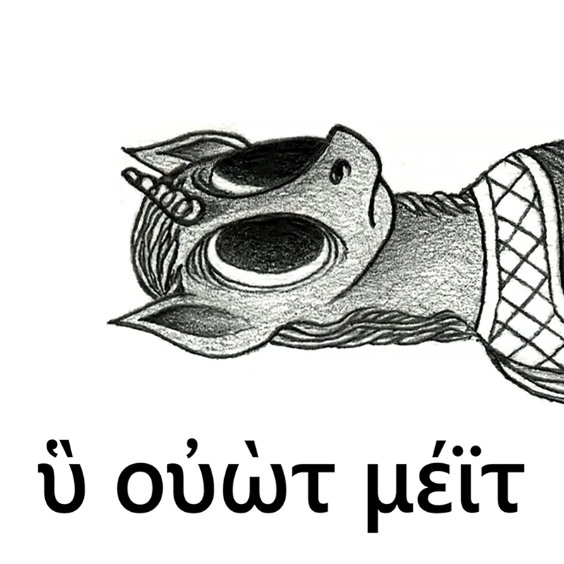
I tried to make a so-called “dank meme”, using a piece of my last good image (>>1065075 (merged)). I’m not sure about the result, but at least I tried.
(Note: this should be “fake Medieval Greek”. I added a diaeresis above the iota (“έϊ”), to imitate the sound /ei/ of /meit/. See also these Modern Greek examples: 1, 2)
(Note: this should be “fake Medieval Greek”. I added a diaeresis above the iota (“έϊ”), to imitate the sound /ei/ of /meit/. See also these Modern Greek examples: 1, 2)
Thank you. It will get even more beautiful, as soon as they merge it with the older version.
Edited
Why, thank you! I’m glad someone enjoys my stuff! :)
Btw, the Skylitzes’ manuscript (from which I took the examples) can be found at this link (National Library of Spain’s site: you can download the single pages, or even the pdf of the manuscript). Thanks to the Internet I’ve found and saved a lot of scans of greek manuscripts over the years: it’s fun to read the words of Thucydides or Herodotus straight from the ‘original’ (medieval) sources, even if it’s quite hard to identify the shapes of the letters & ligatures :S
As for my ‘style’: to be honest it’s mostly thanks to Applebeans-fristdynamo’s “cubist” ponies! The large eyes with big black irises are one of his ‘trademarks’, like in >>13340. The lines around the eyes are more a ‘personal mark’. Also Spectralunicorn’s ponies are quite expressive, very “G1-like”. I still have to draw an image that I can judge really satisfying though :-/
(I thank you with a last bye-zantine miniature! It’s Princess Celestia-Helios’ four-ponies chariot, from the ‘Theodore Psalter’ (from 1066 AD) ;) )
Edited
Heh, I thought it was a little odd the archaeologist suddenly turned into a “ruler.” I figured it was a double meaning, but this makes more sense - and more authentic too, as you say.
I like your ponies by the way. They all have lines around the eyes and big irises, it’s a very distinctive style.
Again sorry for being pedantic, a last example of caption abbreviation that it’s very similar to the one in my picture, and I swear I’ll shut my mouth!
Madrid Skylitzes, fol 49r:
Here you can see the same old Emperor Theophilos (again, bizarre shortened caption above him) in the middle, while next to him there’s a cleric, most likely an Archimandrite (= “abbot”) who is talking to him. The caption above the Archimandrite says:
ὁ ἀ χ (= ὁ ἀ[ρ]χ[ιμανδρίτης] = “the Archimandrite”)
The abbreviation here is radical, the word was shortened to only 2 letters. In a similar way, in >>1065075 (merged) I portrayed the archeologist as a priest, and I put the last caption next to his head, imitating the caption of the Skylitzes:
ὁ ἀρ χ ος (= ὁ ἀρχ[αιολόγ]ος = “the Archaeologist”)
I hope I have clarified everything! ^_^’
Eh, I know that feel… work, duties, and all the rest :)
Btw, thanks again for the exegesis of my other image and captions. I’m happy I didn’t make mistakes, my greek is no more very ‘fresh’… But I must explain two or three things, wall of text coming (I apologize in advance :)
Firstly, you read the captions well, except for the word “ἀρχὸς”: it’s not “ὁ ἀρχὸς …” but “ὁ ἀρχ[αιολόγ]ος ἀποθνῄσκει”(“the archaeologist dies”). As you can see in my picture, I put the χ above the line of text, to indicate an ‘abbreviation’. I was basically trying to imitate the bizarre ‘abbreviations’ you can see in several byzantines manuscripts. Here’s a typical example of what I’m saying:
In this miniature from the same Madrid Skylitzes (fol 43r), you can see from right to left the Emperor Theophilos seated on his throne, and the Eparch of Constantinople standing in front of him. The greek caption above the building says the name of the Emperor:
ὁ Θόφι λ (= ὁ Θ[ε]όφιλ[ος])
with a small ‘λ’ above the iota, to indicate the presence of an abbreviation. Even the caption above the Eparch is arbitrarily shortened in the same way, with a small ‘ο’ above the text:
ὁ ἔπαρχ ο (= ὁ ἔπαρχο[ς])
with a small ‘ο’ above the ‘χ’, again to indicate the presence of an abbreviation.
Again, above the same Eparch riding a horse at far left, another (illegible) caption with a big ‘χ’ above the text, so it’s another abbreviation. In my picture, I put a ‘χ’ above the shortened word, in a similar way:
ὁ ἀρ χ ος (= ὁ ἀρχ[αιολόγ]ος)
Secondly; the phrasing is a little dull indeed, but it was intended to be ‘dull’. The captions of these miniatures can be either long and well-phrased or very short and simplistic, because their main purpose is to explain what’s happening in the miniature and who are the characters represented in it. Another beautiful miniature from the Skylitzes (fol 19r):
Here we can see the victorious Byzantine horseriders, led by the Emperor Leo V the Armenian, charging the fleeing Bulgarian troops, during the Byzantine–Bulgarian wars of the IX century. The two captions say, from left to right:
νίκη ῥωμαίων = “[the] victory of [the] Romans” (Byzantines called themselves “Romans”)
τροπή βουλγάρω[ν] = “[the] rout of [the] Bulgars”
As you see, the captions in this case are very short and simplistic.
I think that the lenght of the captions depends also on the ‘composition’ of the picture, as the captions of the miniatures have also an ‘aesthetic’ value, not only an informative one.
(Just to be even more pedantic: notice how much the byzantine minuscule of the 12th century is different from the modern greek minuscule. I wrongly used the modern greek minuscule, because if I had used the medieval minuscule no one would have understood one word. However the byzantine minuscule is fascinating, see here all the shapes and ligatures.)
However, I must recognize that your sentence is much better than mine; also good use of the genitive absolute! (Thucydides used the genitive absolute a lot, I went mad everytime :S)
Again, thanks for the suggestions and sorry for the huge text! I hope I’ll find the time to draw more weird pseudo-byzantines ponies in the future :)
Edited
You’re welcome, I’m glad to find other people here who like this kind of stuff.
Biblical Greek is exactly what you’d expect, so Koine but with a lot of Semiticisms. I like the Hellenistic era, and it’s what got me interested in Greek in the first place, but I somewhat regret not starting with a more conservative dialect like Attic and working my way forwards. Koine has a few more contractions, but overall it’s simpler, the dual is gone, the optative is rare, a lot of athematic verbs have become thematic, etc. I actually bought a copy of Hansen and Quinn’s An Intensive Course a few months ago thinking I would bridge the gap, but now other things have gotten in the way. Ah well, Greek’s not going anywhere.
I don’t see anything off on >>1065075 (merged). I’m reading ὁ στρατηγὸς τῶν εἰκονοκλαστῶν “general of the iconoclasts,” Ἡ νάφθα “the naphtha,” ὁ στρατιώτης θείνει τὸν ἀρχαιολόγον ξίφει “the soldier strikes the archaeologist with a sword,” ὁ ἀρχὸς ἀποθνῄσκει “the ruler dies.”
The only thing I can think of is that the phrasing is a little dull. I don’t know what the Byzantine convention is when adding captions to illustrations like this, but I might have gone for something like ὁ ἀρχὸς ἀποθνῄσκων τοῦ στρατιώτου θείνοντος ξίφει “the ruler dying as the soldier strikes him with a sword.”
Edited
Well, now this is a serious analysis of greek phonology!
Btw you’re right again, I tried to “emulate” the diphthong sound /eɪ/ of /meɪt/ with a Greek hiatus; but as you said, it’s not the same thing, because with the hiatus the word is no more a monosyllable, but becomes disyllable. So yes, the best choice is [ εί ] as you said, but only if it’s Greek of the Classical/early-Hellenism period; in late-Koine/Medieval Greek the (non-existant) word *μείτ would be pronounced /mit/… I hope there is a brony expert on Medieval Greek in here somewhere :)
Also thanks for the well-thought-out comment, it’s always good to find someone who studies Ancient Greek! I studied Ancient Greek only at highschool, so I can make mistakes… Translating Biblical Greek must be cool!(it should be like Koine Greek? I’m more ‘trained’ in Attic Greek, as I enjoyed translating Thucydides and Plato back in the day.) Also I made another ‘weird’ drawing months ago, with Byzantine-like Greek text here >>1065075 (merged), so if you want you can comment the image to tell me if there are any big mistakes!
(The anon was me, I was worried the comment was dickish, so I anon’d out, hehe.)
My area is more Biblical Greek, so I’m not too savvy on what happened later, but afaik Ancient Greek inherited both /e:/ and /ei/ as a digraph “ει” (with any diacritics written on the second vowel regardless), e.g., λείπει /leípe:/, /ei/ merged into /e:/ already in Ancient Greek, and already by the end of the Koine period both had become /i/ but continued to be written “ει.” The Medieval period had other changes like /ɛ:/ > /ɛ/ > /e/.
I figured this was intended to represent a monosyllabic digraph since that’s what the English /mɛɪt/ is. You could posit hiatus, but the English word is a monosyllable, so I figured that wasn’t it. But as you say, it’s fake Greek, and it’s danker that way. :)
You’re right! The fact is that this should be “fake Medieval (byzantine) Greek”. The diphthong [εί] is written with the accent on the second vowel, as you said, and was pronounced [éi] in Ancient Greek; but in the Middle Ages, the Ancient Greek diphthongs became monophthongs. So, [εί] in Medieval Greek was pronounced [i], no more [éi]. So maybe I should have put ‘dieresis+acute accent’ on the iota, to indicate a hyatus, like this: [εΐ]. But it seems that the dieresis was not always necessary to form a hyatus: putting the accent on the first vowel was already sufficient to indicate a hyatus, at least according to what I found in some byzantine manuscripts (but I could have read the words wrong).
tl;dr, in this picture [έι] should indicate a hyatus, and is pronounced [éi], according to Medieval Greek pronunciation. However, thanks for the comment, I’m not an expert on ancient/medieval Greek, so any feedback is welcome! (Btw, if a meme’s text is wrong, it makes the meme more dank, doesn’t it?)
Edited