
Interested in advertising on Derpibooru? Click here for information!
Help fund the $15 daily operational cost of Derpibooru - support us financially!
Description
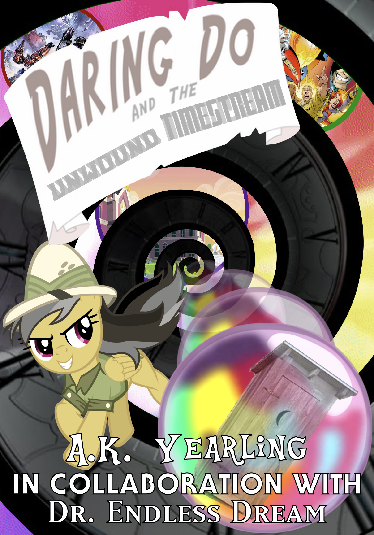
Something I introduced on the TV Tropes page, the controversial Daring Do And The Unwound Timestream, now given cover art.
EDIT: I ended up doing it myself, though it took months to eventually pick it back up and finish it.
EDIT: I ended up doing it myself, though it took months to eventually pick it back up and finish it.
I had an interesting idea when making the updated version, where I tried to make the curve between “Back” and “to the Future” occur in a single line, but it just wouldn’t hold up, so I thought to simply type “unwound” twice, in the “back curve” (captials) and the “front curve” (lowercase) and overlap them, with one being translucent.
From there, I had the idea for “timestream” to be written both forward and backward, with the backward being the forward but graphically mirrored. This would hopefully better present the title.
By the way, “timestream” used the Doctor Who logo font from the days of Matt Smith and Peter Capaldi.
Speaking of fonts, I also found the ACTUAL Chrono Trigger font (this time used for “in collaboration with”) which happens to be a bold version of the font used in promotional posters for Star Wars: A New Hope back in 1977. Go figure.
As for “Dr. Endless Dream” - that font is “MatrixBoldSmallCaps” used for Yu-Gi-Oh! cards.
Yu-Gi-Oh! implemented time travel in a few of their stories, didn’t they?
“A.K. Yearling” is just an “Equestria” font.
Has anyone found that font they’ve been using in the new Equestria Girls logo?
Edited
I think they’re borrowed from NeonVisual, but no, it’s not from the actual in-show opening.
EDIT: Added the relevant tags. Thanks for the catch!
Edited