Uploaded by SpokenMind93 


2500x1666 PNG 1.16 MB
Interested in advertising on Derpibooru? Click here for information!

Help fund the $15 daily operational cost of Derpibooru - support us financially!
Description
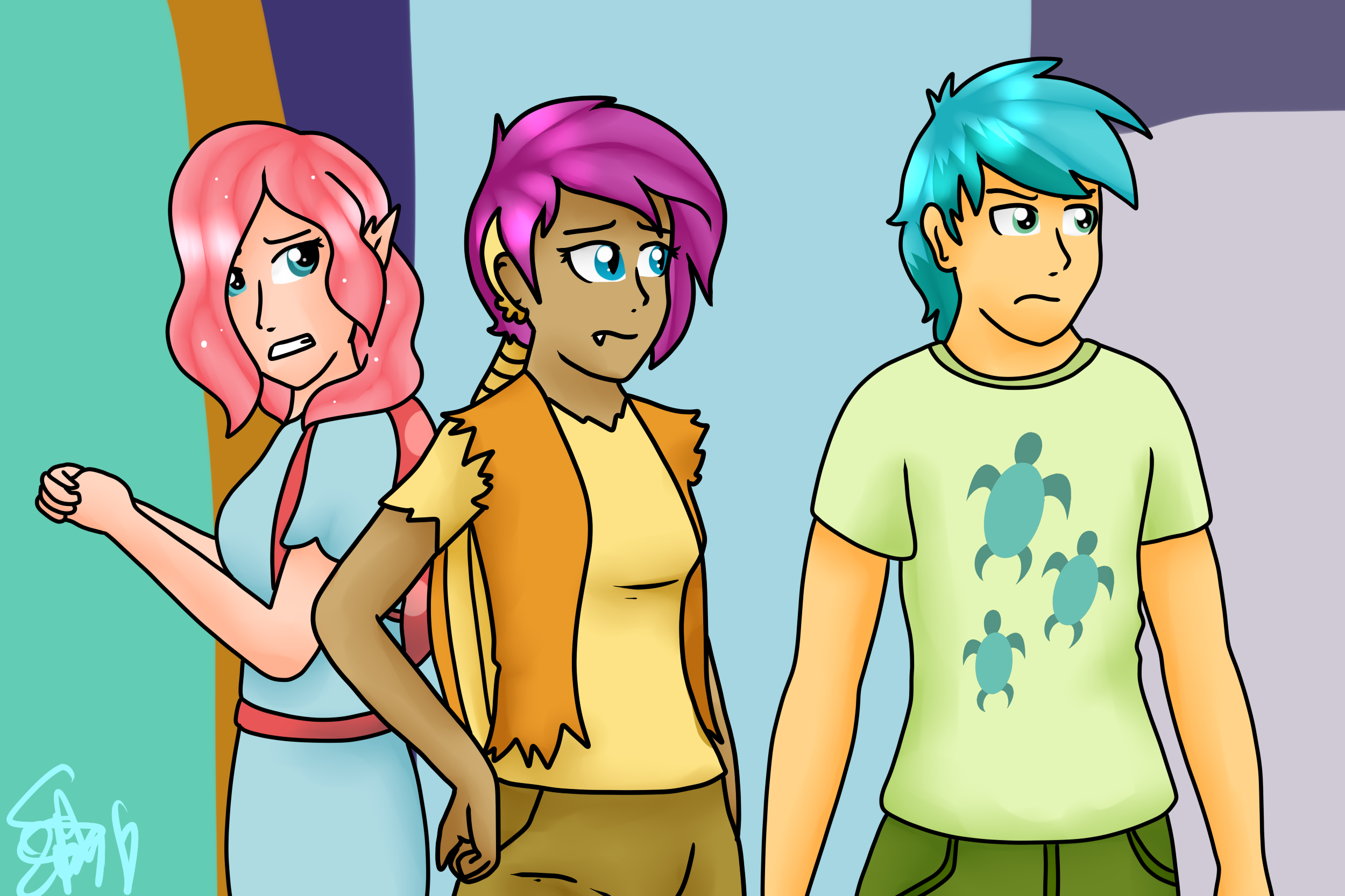
~Sorry, Thorax
I literally wanted to give Smolder a hoodie but then immediately realized she would look too much like Scootaloo xD I then decided to go for punk with dragons. I mean, Spike had already the grungy look, maybe he’ll grow into it. And yes, that’s a piercing accesory in the form of her “ear things” on her ear.
Ocellus was the hardest to humanize because I had no idea how to do something different with Changelings/Changedlings. In the end I decided to give Changelings the shape of their pony ears. And they all have cute backpacks that can transform into wings x3
Almost decided to do the whole screenshot which also included Yona but that was a bit too much
MLPFIM (c) Hasbro
Euhm, not really… In these kind of pictures I use a thick line, the “low effort” ones. In pictures that take ACTUAL effort from my part, I use a much thinner line.
Either way, every artist has their own way of lining stuff. Some do a constant thickness over their whole picture, like me, and others go for the more stylish look with trying to thicken the lines at some point. I don’t want to go for stylish. I like this style.
The problem is exactly that they are all the same thickness and too thick overall. That’s a rookie mistake. It just looks off.
You use this style in all your pictures so don’t try to excuse it with “low effort redraw”.
And why would I need to do that? The lines are all the same thickness so I don’t see the problem. And this is just a screenshot redraw so not an overly elaborate effort picture.
I’m hoping too. But I’m already set on these designs for my personal humanizations ^^