Policy Update - Rules changes incoming for AI content - Read Here
Interested in advertising on Derpibooru? Click here for information!
Furry Body Pillows - Preset and Custom Designs

Help fund the $15 daily operational cost of Derpibooru - support us financially!

Description

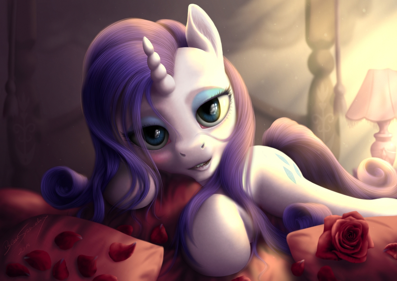
This is the alternate version of >>741560  
With changed lips

+ safe2273162 + alternate version94575 + artist:bluespaceling66 + rarity226229 + pony1706026 + unicorn584266 + g42131486 + beautiful9491 + bed63346 + bedroom eyes87687 + detailed1379 + female1915134 + lip bite16141 + mare809919 + pillow27837 + rarity's bedroom341 + realistic3018 + rose5575 + rose petals354

Comments

Syntax quick reference: **bold** *italic* ||hide text|| `code` __underline__ ~~strike~~ ^sup^ ~sub~

Detailed syntax guide

Background Pony #CD45
@bigmacintosh2000  
Select those elements and rescale to see if you have a point. I would never draw big eyes on a pony myself, but in this style it seems to be the optimal size. I can easily adore them. I’m very curious about his new drawing. It will probably look different, and certainly very good.
bigmacintosh2000
Magical Inkwell - Wrote MLP fanfiction consisting of at least around 1.5k words, and has a verified link to the platform of their choice
A Really Classy Artist - 250+ images under their artist tag
An Artist Who Rocks - 100+ images under their artist tag
Artist -

@Background Pony #96A7  
Like I said, I really think it’s really high-quality work. I think everything else about it is gorgeous, including the lip bite. Whether or not the artist was “going for” something isn’t always the most important factor to consider. I’m not sure it’s nitpicking if it has the effect of turning something that should have been truly a favorite into something that’s slightly disturbing. For me at least. I don’t think changing the size of the teeth would be a huge undertaking if the artist did want to change it based on that observation. The eyes could probably be shrunk about 5-10% without too much trouble, although I think that’s less of a distraction than the teeth. That’s of course the trouble when you work in a highly-detailed style–there’s more room for distraction/error.
 
But if the artist really is “going for” this look, more power to him/her. It’s really good. I just thought I’d share my opinion.
Background Pony #CD45
@bigmacintosh2000  
Those are good points, but I saw early sketches by the artist and I know that he was going for such look. I am certain that he achieved perfection and now it’s up to you if you appreciate the beauty or continue nitpicking as if the things you mention could be done better in this particular drawing. They could not be done better.
 
For me it is not only the most delightful piece of art in MLP community, but of all art that exists.
bigmacintosh2000
Magical Inkwell - Wrote MLP fanfiction consisting of at least around 1.5k words, and has a verified link to the platform of their choice
A Really Classy Artist - 250+ images under their artist tag
An Artist Who Rocks - 100+ images under their artist tag
Artist -

This is super high quality work, but a couple of things combine to make it slightly creepy. One, her eyes seem kind of alien-like. Two, her mouth (and especially her teeth) are too small. The teeth kind of look like what you see on a little kid just before they lose their first tooth, except that they don’t have that creepily large amount of space between them.
Background Pony #6BA0
We may deny reality all we want, but if you ever actually get into Equestria, it’s gonna look more or less like this. Except with more dandruff. So be prepared.
when she felt her wings unfold
Wallet After Summer Sale -
Magnificent Metadata Maniac - #1 Assistant
Not a Llama - Happy April Fools Day!
Perfect Pony Plot Provider - Uploader of 10+ images with 350 upvotes or more (Questionable/Explicit)

Goodbye Ponk Pie Hat
Seems quite an improvement to me, with the lips at least. Ponies in lipstick do seem strange, and the blood-red shade and intense edge was quite the attention-drawing highlight.
 
I’m no expert, and it’s hard to judge and you really have to try not be be unkind with this sort of stuff. Take what I say with a pinch of salt, please, but what I see:
 
  • Rarity’s face has a danger of becoming rather mask-like. All that white.  
    – The effect seems to be made greater due to the pillow and hair intersecting the shape of her face near the bottom, making it appear narrower at the base  
    – she could just as easily be resting her chin on the pillow.  
  • The mouth is perhaps a little narrow for the muzzle  
  • Her teeth are their own thing entirely… below.  
  • This may be a personal bugbear, and can probably be most safely ignored. But there seems to be too great an emphasis on EACH AND EVERY STRAND OF HAIR AT EVERY POINT. Hair is super, super fine stuff which works more as masses or strands, so painters often soften the edges a lot and render it with big brushes, saving the little detailers for highlights or other places where light picks out strand-level light or gloss.
     
    @soundtea  
    There’s a lot in this. They seem a little small for her face somehow, and rather sharply defined and discontinuous still. Softened edges and remembering that darker areas are necessarily less sharp to the eye may help?
     
    Eh, I dunno.
soundtea
Solar Supporter - Fought against the New Lunar Republic rebellion on the side of the Solar Deity (April Fools 2023).
My Little Pony - 1992 Edition
Wallet After Summer Sale -
Not a Llama - Happy April Fools Day!
Perfect Pony Plot Provider - Uploader of 10+ images with 350 upvotes or more (Questionable/Explicit)
Fine Arts - Two hundred uploads with a score of over a hundred (Safe/Suggestive)
Magnificent Metadata Maniac - #1 Assistant
A Perfectly Normal Pony - <soundtea> fappin to cartoon horses
The End wasn't The End - Found a new home after the great exodus of 2012

Ocellus is best buggo
Yeah, looking at this the problem seems to lie with the teeth. They need to be a bit more cartoonish in a way.