Uploaded by Background Pony #0846
630x969 JPG 591 kB
Interested in advertising on Derpibooru? Click here for information!
Help fund the $15 daily operational cost of Derpibooru - support us financially!
Description
No description provided.
Tags
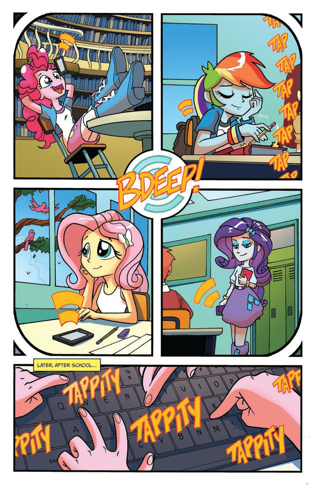
+-SH safe2248967 +-SH idw21748 +-SH fluttershy267213 +-SH heath burns533 +-SH pinkie pie264064 +-SH rainbow dash288627 +-SH rarity224264 +-SH bird15278 +-SH equestria girls265793 +-SH g42109579 +-SH my little pony: equestria girls holiday special139 +-SH balloon13548 +-SH boots35959 +-SH bracelet16892 +-SH classroom2338 +-SH clothes668894 +-SH high heel boots9394 +-SH idw advertisement594 +-SH iphone805 +-SH jewelry122770 +-SH keyboard1730 +-SH library4416 +-SH lockers2876 +-SH phone13171 +-SH skirt59258 +-SH smartphone5687 +-SH typing184
Loading...
Loading...
Well, I haven’t read that far into the series, but I don’t see what so bad about Chrysalis, and the characters felt overall pretty in-character to me. Rarity is still “fabulous,” and dramatic, Dashie’s still brash-yet-loyal, Fluttershy’s still shy, Applejack’s still down-to-earth, Pinkie’s still Pinkie. I kinda liked Nightmare Rarity’s design though.
But to each their own. It’s not everyone’s cup of tea.
I don’t like how different the style of the comics is from the show. The personalities of the characters feel very different in the comics, and the stories are usually a little off. The Nightmare Rarity concept, the phoned-in atrocities of Chrysalis, the incredibly absurd notions depicted in Reflections, Twilight’s ridiculous new “rules” about how to use her magic…
They’re all just way too hammy and contrived, and that perception isn’t helped by the way some of the writers and artists can be a little self-aggrandizing at times.
I don’t see what’s so bad about them, some of the stories & art are pretty good. And I never was bothered by the pop-culture references/cameos, or so-called “pandering” either that some complain about. (Which they’ve cut down on a bit in recent issues actually.)
I don’t like him either.
That’s already 2 negative opinions and if you have been paying attention you will notice how I constantly say how much I want to like the comics but there’s always a pile of dealbreakers that keep me from liking it.
YOU can’t say anything positive about him. I generally like his work - Friends Forever #2 was excellent, probably saved that series after the dreadful first issue. With Ponies, he’s quite good. Yeah, his EQG stuff looks kinda off sometimes, but more often than not it’s fine, nowhere near as bad as you constantly insist.
Seriously, do you just read the comics nowadays simply so you can come on here and trash them? If so, I pity you.
I was thinking of Nico Robin’s power.
Can’t unsee that face.
I feel differently, some of his stuff is pretty good, though I admit I think his cover art is usually better then his inside art. I also feel he draws ponies better then he does the EqG style humans.
I did kinda like his take on Babs though.
@Itsthinking
It’s Pinkie Pie. You gotta give her the benefit of the doubt. Not excusing the other stuff, but come on. Pinkie Pie.
I get having a different style, but the whole mistake with Pinkie’s phone just gets me. That’s not advanced perspective shit, there.
@Itsthinking
It’s 2 years already and by now is evident he will never get any better than this.
Nearly two years ago. It’s been two years and you can’t say many positive things about him.
Tony did make stuff like this before…
Tony “Quality” fleecs stryke again
>Pinkie’s phone not even close to actually being balanced on her nose
>Those screwed up fingers, despite being referenced
>overall QUALITY
Why?