[NSFW] What's so good about this, and what's so bad about this?

Ocelot60
Perfect Pony Plot Provider - Uploader of 10+ images with 350 upvotes or more (Questionable/Explicit)
Artist -

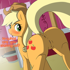
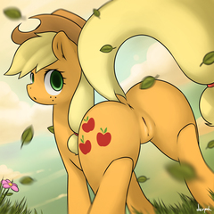
This, image [1] is my most popular image, I recently redrew and improved it. It was originally a sketch by Derpah, now known as Marble-Soda, but I certainly didn’t do his image any justice, in fact, he even coloured this piece in himself as shown below [2], but low and behold my image is more popular despite being posted later and clearly being worse from an artistic standpoint.
 
[1]  
 
[2]  

 
It truly makes me question, what does the general audience what? What does the average brony want? Is it the fluff text? The cell shading? The relatable background? Somehow, and someway, people were able to look past the poor lineart, the mistakes and overrate it significantly.
 
But is it overrated?
 
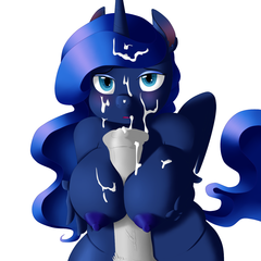
On the other side of the spectrum, here’s a picture [3] I really like, one I drew a lot more recently with more experience. Once again it’s a recolouring (by GlacierClear) so my sketching skills isn’t in question here. People really didn’t like this and it turned out to be one of my generally least upvoted pictures despite the fact I thought it was personally one of the best pieces I’ve done yet, and while I can understand a few issues with the shading being too dark in areas for appropriate contrast I can’t understand the mindset of my audience.
 
[3]  

 
So lets say, I add a background, I add some text, I fix a few minor issues here and there, how significant is that impact? Lets do a quick test shall we?
 
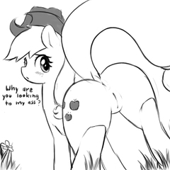
Here’s a quick 5 minute edit:
 
[4]  
full
 
So what’s it like now? Is this truly the difference between 150 upvotes and 300 upvotes? A ‘meh’ picture and a widely praised image?  
(On an ignorable sidenote, even deeper on this side of the spectrum, is an image that was absolutely panned by you guys despite the fact I thought it was ‘okay’. >>969764 I made a lot of mistakes, but at the same time I didn’t think it was utterly terrible, I would like to know why this was panned so hard compared to anything else I’ve drawn)
 
Is there something psychologically more going on here? Perhaps there is, perhaps the inclusion of the text makes a significant difference, it somewhat puts the viewer into the picture makes them feel as if they are being directly spoken in some clever pseudo fourth wall break that adorably seems to mimic fun of the fact it’s what the average viewer might spend the most of their time staring at.
 
But then again, I think this image here cracks that theory somewhat.
 
[5]  

 
I’d argue that this particular image is BETTER than my recolour, that’s right, I think my recolour is /that/ bad, there are many mistakes and a very poor sense of lineart and direction in the image, then perhaps the colouring itself is overrated, the cell shading? What truly is it? Lets have a discussion.
 
Lets pose a few TL;DR questions as a thought for talk.  
Why is [1] widely rated higher than [2] (and by extension [5])?  
Why is [3] rated so lowly overall? Is [4] really that much of an improvement?
 
If you guys can answer these questions, we might just be able to crack the mindset of an average derpibooru user and figure out what they truly want and what they don’t want! Beyond simple artistic quality, beyond conscience wants and needs but subconscious ones.
KnifeH
Hard Work - Merited Perfect Pony Plot Provider badge with only their own art
Perfect Pony Plot Provider - Uploader of 10+ images with 350 upvotes or more (Questionable/Explicit)
An Artist Who Rocks - 100+ images under their artist tag
Artist -

People are wankers :D.
 
It also depends on when it was uploaded (weekend vs normal week day, if you’re in Europe and upload it at a the time most US users are asleep, etc..)
 
I’d also say that some people prefer show-accurate porn, so rather than softer shading people tend to fall for the cel-shading cause it springs more towards what you’d see in an anime or cartoon show these days.
 
You can’t justify a simple linework (no attempt of shading, even if it’s monochrome) with something that has been colored.
 
Upvotes don’t matter that much to be honest. I see it as a (for NSFW) wank-o-meter.
Vree
Lunar Supporter - Helped forge New Lunar Republic's freedom in the face of the Solar Empire's oppressive tyrannical regime (April Fools 2023).
Not a Llama - Happy April Fools Day!
Magnificent Metadata Maniac - #1 Assistant
Derpibooru Premium - Learn about the benefits of subscribing to Derpibooru Premium membership at https://derpibo
Fine Arts - Two hundred uploads with a score of over a hundred (Safe/Suggestive)
The End wasn't The End - Found a new home after the great exodus of 2012

[1] is clearly better.  
In fact, (even though upvotes can be unreliable for a number of reasons) I find that whenever an artist asks this the older picture always seems to be better. So my counter-question would be, do those artists really don’t see it?
 
[1]’s eye is bright and has the white light spots, so it seems more awake and alive. On [2] you left out the light spots and smudged the green color, causing the eye to become dead or unconscious. In cartoon language this is usually used to indicate that the character is “not there” - hypnotized, asleep, “throws a blank” over how much she loathes you, etc.
 
[1]’s shading and colors again help to generate the illusion of a sunset. In [2] light sources might as well not exist. It’s not just that there seems to be little light, but it’s also not clear from the placing of the shadows where it is coming from.
 
[1]’s colors harmonize better; in [2] using colors & shades which are closer to each other for the pony, hat, and background makes the whole pic look pale.
 
[2]’s leaves are unconvincing to me. They are all shown from the same angle but seem to fly from all sorts of directions. Like, is there a whirlwind around AJ or something? ANd the smudge effect - I get the intent that this sharpness change was meant to be photographic but it did not turn out very well. I don’t think it’d turn out like this on a real photo. I think [1]’s more lineart light bg works out better here.
 
[1]’s placements seem to be better too. I don’t know how this is called in artist language, but when you break it down to the chief lines and colors, it’s just composed better.
 
You probably learned a lot about things like soft shading and put that effort in the 2nd one, but what decides a pic’s popularity is the total effect and I think in [2] that came out poorer.
Exedrus
Lunar Supporter - Helped forge New Lunar Republic's freedom in the face of the Solar Empire's oppressive tyrannical regime (April Fools 2023).
Best Artist - Providing quality, Derpibooru-exclusive artwork
Princess of Love - Extra special version for those who participated in the Canterlot Wedding 10th anniversary event by contributing art.
Silver Supporter - Silver Supporter
Heart Gem -
Not a Llama - Happy April Fools Day!
Friendship, Art, and Magic (2017) - Celebrated Derpibooru's five year anniversary with friends.
Happy Derpy! -
Responsible Disclosure -
Artist -

@Vree  
Adding to Vree’s reply, one other thing that works for [1] but not as well for [2] is that [1] has a higher degree of contrast. This is not only because AJ has sharper/darker shadows, but also because the background provides a better array of colors that contrast well against themselves and the pony in the foreground. Ya kinda got to really stare at it to see the clouds in the background of [2]. But even just a fleeting glance at [1] and you know immediately where AJ is standing.
Ocelot60
Perfect Pony Plot Provider - Uploader of 10+ images with 350 upvotes or more (Questionable/Explicit)
Artist -

Just to clear up, [2] belongs to Marble-Soda and is the original artists rendition of his sketch, whilst [1] is my rendition of his sketch.
 
You bring up really great points actually, I was always looking for a buddy/friend to be somewhat of an art coach, tell me what works and what doesn’t work beyond what you merely see at a glance. It’s surprisingly hard to see those out-of-the-box flaws of your own work sometimes, I’m always fussing over tiny little lineart or colour errors when the real issues seem to be more so the general feel of the picture and how the art compliments that. What I’ve managed to draw from your comments is that there is more than just ‘pretty picture to fap to’ to all this, it goes really deep.
 
Any thoughts on [3] and [4] then? Why didn’t people like [3] that much? I took the differences between [1] and [2] and applied them literally, but I realize now that might be missing the point, a background and some text can make a picture more interesting sure, but it doesn’t /make/ the picture. What does [3] really need? Because I personally think it looks amazing, but it’s clearly missing the quota in some regards, quoted as looking ‘weird’ even.
Dashu
Magnificence - Artist with 100+ Safe/Suggestive images with over 100 upvotes, and 5+ Questionable/Explicit images with over 350 upvotes
Non-Fungible Trixie -
Friendship, Art, and Magic (2020) - Took part in the 2020 Community Collab
The Magic of Friendship Grows - For helping others attend the 2020 Community Collab
A Really Classy Artist - 250+ images under their artist tag
Charitable Contributor - Contributed to a series of art packs that helped raise over $10,000 for charity
Wallet After Summer Sale -
The Power of Love - Given to a publicly verified artist with an image under their artist’s tag that has reached 1000 upvotes
An Artist Who Rocks - 100+ images under their artist tag
Hard Work - Merited Perfect Pony Plot Provider badge with their own art

Dashu The First
People really didn’t like this and it turned out to be one of my generally least upvoted pictures despite the fact I thought it was personally one of the best pieces I’ve done yet
 
You have to get used to it because it’s going to happen every time. No matter what type of content you create, it happens everywhere, many artists don’t like their most popular pictures, somehow your most popular picture is always that old, ugly picture you drew a year ago, the one that doesn’t make any sense, a very simple and fast picture you did in one day that is a piece of crap in your eyes but somehow it’s still much more popular than your recent work that you are proud of.
 
One of my first pictures got into the “3-day top scoring”, it received like 250 of score in just ~2h and why it happened is still a mystery for me. It was ugly, the anatomy was ugly, there was no background, the pose was simple and boring but still.. it’s my only picture that was getting upvotes so quickly while many of my recent pics have a problem to get half of that score even if they are 100x better.
 
Also if we are speaking derpibooru-wise there are a lot of stuff that matters, like the time when you post your pic or what images are top scoring right now and who drew them - if some popular artist has posted some stuff and is occupying most of the slots with relatively high scores, people will be focussing on these pictures very likely, so the probability that someone will click your picture when there’s an Atryl’s pic with 600 of score next to it is much smaller.
 
So basically the score doesn’t mean anything, there are a lot of things happening that may affect the score and it has nothing to do with the actual quality of the art. Sure there are things that people like more than others but in many cases the picture itself doesn’t matter that much but the number of people who will get a chance to see it does.
Goremise

@Dashi
 
exactly this, there is countless situations that can happen that cause less people to see your artwork, especially on this site with how things are constantly being uploaded to it, more often then not good pieces can go totally unnoticed. I know that’s the case of me, sometimes one good animation will be out that will grab my attention for awhile, at which point I stop looking at all non animation artwork, making me miss hundreds of images.
 
then whenever I do just search a general tag, like the sex tag, There’s so many to go through, I never make it that far in xD
 
and on the other point, I’ve seen that too, with older artwork looking better then newer, take link for example, yes there is a lot learnt and probally much much harder to make the newer one, but in general, everyone liked the first one more.
Ocelot60
Perfect Pony Plot Provider - Uploader of 10+ images with 350 upvotes or more (Questionable/Explicit)
Artist -

@Dashi
and on the other point, I’ve seen that too, with older artwork looking better then newer, take link for example, yes there is a lot learnt and probally much much harder to make the newer one, but in general, everyone liked the first one more.
 
Sometimes more is less it would seem, especially when it comes to cartoon ponies sometimes it seems like people prefer them to look like the cartoons they remember rather than these ultra realistic or highly detailed pieces of art, that being said, it seems like if you’re drawing for the general public, a balance needs to be struck, though if you’re drawing for yourself, let loose and go wild. I’ve actually noticed this a lot, the more detail I start to add to some of my images, the less attention they seem to get.
Eggonaught
Perfect Pony Plot Provider - Uploader of 10+ images with 350 upvotes or more (Questionable/Explicit)
Hard Work - Merited Perfect Pony Plot Provider badge with only their own art
Not a Llama - Happy April Fools Day!
The Power of Love - Given to a publicly verified artist with an image under their artist’s tag that has reached 1000 upvotes
Artist -

Standing out in a thumbnail determines most of an image’s score, which is why each panel of a 10 panel comic will get a higher score when they’re posted individually. People open a pic (or even fav/upvote without looking) based on what they see in the thumbnail.
 
Everything that Vree and Exedrus already said counts double for thumbnails, especially colour and contrast. Text you can read from the thumb helps too.
 
Also, when an image is uploaded makes a big difference. Uploading a pic on tuesday night right before a bunch of episode screencaps that force it off the front page is going to hurt the score. Not sure when prime-fapping-time is, but knowing our lot probably friday night?
 
Also also, after a few days most views to an image come through tag searches–especially artist tags. Your version of the pic got extra views from both Derpah and your own artist tag.
 
Small differences in score don’t mean much about quality. One of the most popular pics on the site, while it is really really good, got such a massive score by spending an entire week in the 3-day-top-score box thanks to multiple merges.
 
A friend or artist saying what they liked (and didn’t like) about a pic means so much more than random upvotes.
Crocface
Artist -

The classic artist’s paradox: The time and care put into a work is inversely proportional to how popular it will be. Spend hours laboring on a picture, getting it just right? No one cares. Make a lazy, 10-minute scribble? It’s your most popular work.
 
I think at the end of the day most artists are too close to their work to see things objectively. The audience can’t see that you intended to do this or that, or that X and Y didn’t turn out how you want, or that this or that bit happened by accident. While an artist will always be able to look at a picture and compare it to what they wanted it to be or what it could be, the audience can only see it as it is.
Background Pony #EEE9
Been looking at paintings lately, since I’m finally trying to study the basics. This is a great example of an amazing pic that got no attention because of how it thumbnailed.  
full
Goremise

@Kirb
 
that’s due to everyone loving coloured versions of the sketches of just lines that we get sometimes. a image can get a small following, as people patiently wait for it to be coloured :3
 
I know I’ve done that myself to a few non coloured images now.
Interested in advertising on Derpibooru? Click here for information!
My Little Ties crafts shop

Help fund the $15 daily operational cost of Derpibooru - support us financially!

Syntax quick reference: **bold** *italic* ||hide text|| `code` __underline__ ~~strike~~ ^sup^ %sub%

Detailed syntax guide