Uploaded by LIsa400 


4750x2000 PNG 4.03 MB
Interested in advertising on Derpibooru? Click here for information!

Help fund the $15 daily operational cost of Derpibooru - support us financially!
Description
No description provided.
Tags
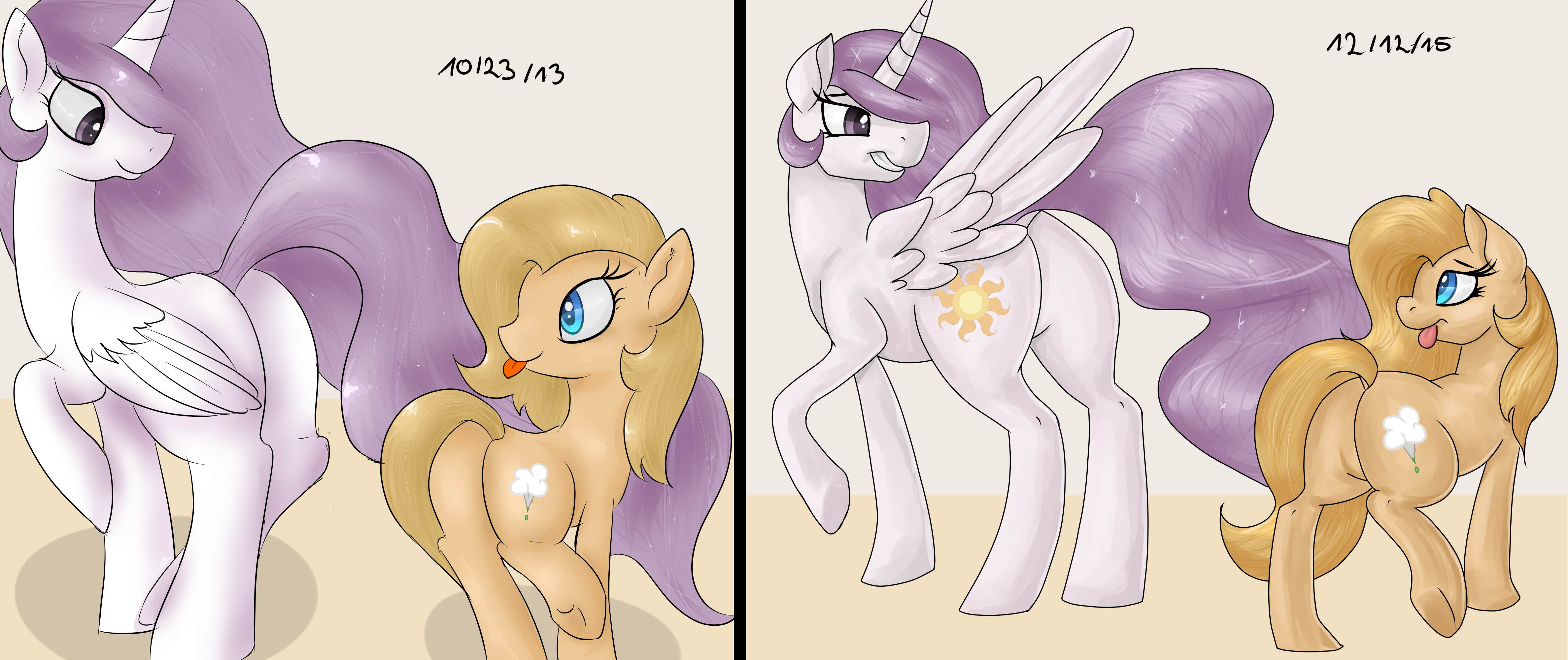
+-SH suggestive193826 +-SH artist:lisa400207 +-SH princess celestia114704 +-SH oc969096 +-SH oc:backy1282 +-SH princess molestia3415 +-SH g42069446 +-SH 2 panel comic3790 +-SH bedroom eyes84551 +-SH butt239386 +-SH comic137865 +-SH comparison5370 +-SH draw this again300 +-SH plot149374 +-SH plot pair1436 +-SH redraw3388 +-SH smiling413122 +-SH tongue out151615 +-SH underhoof70979
Source
not provided yet
Loading...
Loading...
Myeah, smoothness is something that goes down when you move towards more anatomical fidelity.
But everything else got better.
I marked the leg in green. Sure now I realize you could see a tiny bit but I guess I forgot to line that part
Yeah, I would. Is it bent to a great degree or something?
nope, the leg’s just hidden. do you want the sketch to see how it’s hidden?
Yeah I didn’t mean to imply that you got worse. Your technique is better but I just have a preference for the style on the left. It looks more show accurate and cartoony. I think they’re both valid styles.
That is probably derived from moving from show-accuracy (to a degree) towards a more realistic depiction of anatomy. With the earlier portrayal with the more smooth curve being on the same page, the added bulk on the right will code as masculine due how you perceive things in relation to each other.
Kinda how a low saturation red will look a lot redder than it actually is if put next to a high saturation blue.
Thank you!
What? That wasn’t sarcasm. You improved a lot.
I can’t tell if you’re sarcastic
@Background Pony #8C43
wtf the old one’s line art is horrible, the shading a mess, anatomy not present (I mean come on, Molestia doesn’t even have a body, her neck is literally connected to her butt) and you say it looks better than the new one? Sure the new one isn’t perfect but definitely not worse than the old one
Thanks!