
Interested in advertising on Derpibooru? Click here for information!
Help fund the $15 daily operational cost of Derpibooru - support us financially!
Description
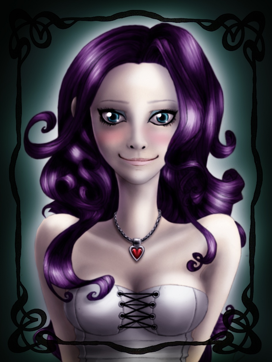
Never worked so hard on a piece. Hope it was worth the try.
Link to newer version: http://derpibooru.org/images/122498
Link to newer version: http://derpibooru.org/images/122498
Not much have changed in the new version.
But it’s just enough.
That Rarity is still creepy looking, but she’s not scary anymore. The smile dont looke “stamped on”. Now it look like she’s less alien, and more human with the fuller cheeks.
I saved the new one over the old one.
Good job!
Only thing you need to do is to upload the new one over here with a link to the old version. Finally, edit the description of this here image to link toward the new one on Derpibooru.
Finally, I’ll ask again: please do a Pinkamina in this style. I so want that!
I usually save fan-comics.
I dont usually save fanart.
But when I do, it’s something special.
It IS a good drawing because it gave me and many other a emotional responce: fear and uneasyness.
Why?
The alien proportions is not really the cause. It’s the fact the she look STRAIGHT AT US, in the eyes, with a very, VERY creepy grin. Then, to make matter worse, the lighting is low with high contrast, giving the overal picture a very heavy atmosphere.
Now, please grant me this humble request:
MAKE THE EXACT SAME THING BUT WITH PINKAMINA DIANE PIE.
I can only pay in internets but I’ll give you all of them if you do!
And maybe I overexaggerated her skin’s pale tone. With no environnement around, I can’t blame it on the light, even if it’s the case.
And Beau Skunky, thanks for your support. I always appreciate a positive comment. And I surprisingly get very few of them here…
Better then anything I could ever draw. The smile needs a li’l work though, (which might be why some say it’s “creepy”) but other then that, I think it looks pretty good, and your coloring is quite professional.
And I must precise your thoughts. I am already trying to get out of the anime-style (because I fucking hate it), and I have been trying for years now. The true matter is I don’t draw many human beings, so it gets hard sometimes.
Finding my own style on human beings is currently a work in progress, and even if you may not think so, this is a proof of it. I’ve made a huge step forward in a short amount of time.
OK, I think I’ve understood she was scary and all (although I still don’t understand why). But you seem to have the answers many could not get. Does this scary side only have to do with the proportions? I mean, reducing the eye size, making a wider neck and so will not change the whole thing much, will it?
And by the way, sorry to say the webcomic doesn’t look that good. It still has many traits I don’t like in “manga” style (because it still sticks to it). However, the artist has made a whole lot of efforts, being able to go from something I would classify as “horrible” to something “I don’t like but quite well done”, even if he tends to over-over-exaggerate many expressions.
Well, I’ll just practice some more.
Let’s say using a faux-anime reference and trying to do something semi-realistic wasn’t a good idea…
I dont know what you were going for. Was it to make her look sexy and cute? In that case, it failed horribly. Was it to scare the shit out of us? Damn, in that case it’s very effective!
Try doing it again by giving her more human proportions, just to see how it turn out.
I see you have enormous potencial. Never do what I did, meaning never give up on your art and keep practicing. Under that scary faux-anime style pupae, there’s a beautiful and wonderful butterfly trying to emerge.
Here’s the link to a complete webcomic. It started in a OK faux-anime style.
(page one)
http://girlyyy.com/go/1
However, when the artist finally let go of these shackles and went for his own style, it became awesome.
(random page from the one of the last chapters)
http://girlyyy.com/go/624
Carry on!