
Interested in advertising on Derpibooru? Click here for information!

Help fund the $15 daily operational cost of Derpibooru - support us financially!
Description
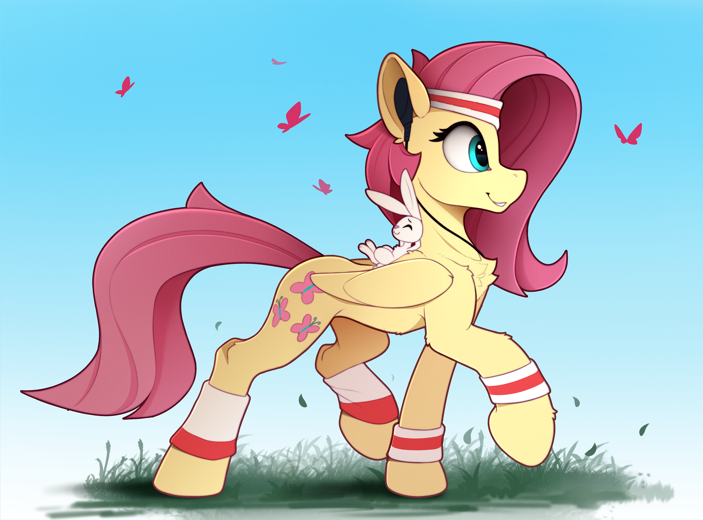
No description provided.
Help fund the $15 daily operational cost of Derpibooru - support us financially!
No description provided.
As I said, the point is not in the details, the matter is in the style of the characters.
Yes, this picture is not very badly drawn, although this is not his idea. He indicated in the description that he was inspired - http://www.furaffinity.net/view/31193585/
On the whole, different tastes are already going on here, but I personally don’t look at his ponies dog faces.
By the way, this Fluttershy is one of the few pictures that I liked lately. :)
Well I think you’re comparing quality vs quantity. There’s no way these two drawings took the same amount of time. The artist can churn out more often with less detail.
It’s not like he’s completely stopped doing detailed drawings.
https://derpibooru.org/2068917?q=artist%3Ayakovlev-vad
Is from two months ago.
He used to try better on drawings, for me he was an example of how to draw.
It is not a matter of detail, the colors were better and the overall style of the pony. Now he has greatly simplified character drawing.
link: https://derpibooru.org/712124?q=artist%3Ayakovlev-vad
But as I said, people like it, so that he does everything right. But he lost a part of himself unfortunately.
I like the style, but agree they look more feline or canine build esque rather than pony to me.
And in general, over the picture itself, he began to be very lazy.
But I see by the rating of the drawing people like it and they are all happy with it, so Vadim is doing everything right.
¯*(ツ)*/¯
I agree. Also what’s with Fluttershy’s torso and belly? She looks like she hasn’t eaten in weeks.