A vote for the search field size remaining as-is, or else the expansion effect being a user-toggleable option. I like it small and cozy.
I also have a 1280px-width monitor, so it wouldn’t even double the size of the field for me, so I’d be one of those getting the least benefit out of it.
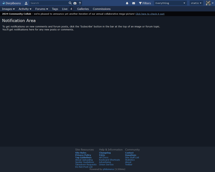
I’m also not sure if the images beside the buttons for Images, Activity, etc. are specifically intended to bring more attention to them, but they feel very unnecessary. As it is, the words alone run about half my screen width, which feels like more than enough.
The little grey bars underneath the drop-downs (for filters and spoilers) beside the profile picture, perhaps specifically in addition to the rounded corners on the drop-downs, make the drop-downs feel pinched in addition to rounded. That bar really blends into the button itself and almost makes it look like the bottom of the button has a downward bow/curve. Which in turn makes my eyes want to interpret the top as having a similar effect, insofar as seeing the top corners begin rounding off much quicker than they actually do, altogether creating something like an oval with flat left and right sides. (Something that’s probably particularly easy for my brain to believe due to having played around with CSS, having made elements look that way while fiddling with things at some point.)
As
@BP#1057 mentions, far too much vertical padding in the top area as well. If I’m doing my rescaling correctly, the new design’s entire header as a whole takes up exactly as much vertical space as the current header
plus the notification bar’s vertical space.
Also, the way the profile… bubble? sticks out above and below the vertical reaches of the nearby drop-downs is cute and witty in its own right, and honestly does look good in this example, but I just can’t get behind it as a change. Not if it helps provoke the additional vertical padding/whitespace.
Now, these next two I’m going to mention tenuously, as I can’t tell if they’re intentionally part of the redesign, or if they’re simply a byproduct of generating the preview:
I really don’t like the concept of making the topmost bar the same color as the background, such that the bar beneath it just cuts through the continuous color and sticks out like some sort of lone ribbon strand. More specifically, I really hope we get to keep the topmost bar being the nice shade of solid blue that some of us - or at least I - have come to associate with the site.
I also really hope that the site will continue to proudly state its name as Derpibooru and that we’ll continue to have Trixie’s cutiemark as the icon, of course.
(That being said, the icon for Philomena does look pretty nice!)
And please, please don’t go to the abhorrent circular profile picture concept that everywhere else has gone to. It doesn’t look better than the square version. It never has. All it does is elbow-in more whitespace where there previously wasn’t and artificially limit avatars by making a lot of otherwise fine images look wonky and/or bad because of the forced rounding cutaway. Plus, for users that really want their avatar to be a circle, it’s not at all difficult to modify an image into that fashion manually.
(Although… While using a placeholder BGP# image, I can’t deny that it looks adorable. Like a little pony looking through a window…)
And for the nitpickiest of nitpicking:
-
I’m still not a big fan of the rounded corners.
-
I’m also not a big fan of the drop-down indication triangles becoming V’s.
-
What’s with / why the grey bar along the top of the screen?
-
I don’t appreciate the darker background color choice. And I realize this must sound VERY assassin because of how small the difference actually is, but it’s something that my eye caught very quickly. However, just to make sure I wasn’t crazy and just stuck in full-on ‘new must be wrong’ mode, I pulled up the example image and an image of the current site in paint and put a swatch from the new one onto the old. I hadn’t realized how small the difference was before then. But some simple play with the bucket tool showed me the difference was a lot bigger when the whole screen color was changed from one to the other.
- Actually, as I go back and double-double-check this, I’m realizing that pretty much all of the colors are different. Specifically, they all seem to be desaturated - and in a darker, greyer way, not in a pastel way. Like the life has just been kinda sucked out of the site. Or its power’s been drained, or something. It’s dreary, and not in the nice likes of a pleasant rainy day.
(Except the bottom-area color, which did actually become bluer.)
-
The centering and reformatting (addition of the bar) for the primary text is fine, I suppose. It’s inoffensive, but, again, unnecessary. However, the way the second sentence continues on the same line rather than being on its own line, causing the screen-wrap to a second line regardless, bugs me specifically. Probably egregiously pedantic, but still.
- I also don’t appreciate how much sharper the bolded text / header is, be that from a change of font, a change of text weight, the change of the background color(s), or any mix/match of the above. (I double-checked, and the color itself appears to be the same RGB values, so I presume that isn’t the source.)
-
However, the formatting being applied to the page-bottom text (Site Resources, etc.), along with part of that text being turned to white from dark-grey, makes it far too loud and attention-grabbing for as passive as (I presume) it should be. Especially with the heaps of vertical spacing being added; there’s something to be said for enhanced readability, I’m certain, but this just feels like far too much. The link text being paler, creating additional contrast with the background down there, doesn’t help the matter.
Overall, it feels like the shift is intended to enforce contrast - push the background further into the background and sharpen everything else. Which, in this user’s opinion, comes off as jagged, compared to the smooth blending and, again, coziness of the site’s current outlook. As it stands, the site’s header and footer have their elements neatly organized and tucked away just where they should be, while the proposed new design puts a lot of emphasis on things that really don’t need it.
But the bottom line? No, it’s not going to kill anyone, if anybody else even really notices the difference, and I severely doubt it’s going to make anyone stop using the site. I just feel ‘blegh’ and disappointed when I flip between the two.
And, yes, I understand that it might seem I have a general ‘ewwwww, new = bad!’ outlook bubbling underneath this, despite how much I’m trying not to, and I don’t have a specific rebuttal to that takeaway. But I’ve at least tried to ensure my majormost complaints are grounded.
I apologize for coming off as a vehement Negative Nancy, I just sincerely don’t have a positive opinion on any of these changes. I get the feeling there’s some degree of intention to ‘modernize’ or somesuch similar, if I may be so bold (and open to correction!), and as I personally don’t gel with modern site design all that much - or any modern design that focuses overmuch on minimalism and/or contrast - that clash is likely showing up as a major bias.
I also realize that I may be an outlier in more of these opinions than the one, so if anybody would like to swamp with me counter-opinions, be my guest. Additionally, if there are specific reasons for some of these changes, I’d be interested in those explanations as well, for the sake of context. Furthermore, it was very difficult to get 1:1 comparison between the proposed and current versions of the site’s layout, given that the image posted seems to be 2x compared to my resolution, but I tried to get as close as I could before being certain I had a complaint.
And I further realize that this was probably a scathing review of what was likely a considerable amount of effort and consideration on display, and I would be fully understanding of receiving equal scathe in turn. Once more, I apologize for the proverbial, verbal ‘shitting on things’. I hope this can at least generate some additional discussion.
If I can leave off on any positive note, part of me has a very easy time believing that a number of these changes, particularly those affecting/concerning readability and/or contrast, would probably be wonderful for a mobile version of the site / the site’s mobile version. (I have never sought out or intentionally used it, given that the smallest screen I’ve accessed the site on is a 9in. x 5.5in. tablet and I’m otherwise a desktop user. But my time on even a mobile device that large has given me some experiences with sites/apps that’ve made me keenly aware of the importance of the size of things - both in regards to comfortable text scale as well as tap/touch room.)
I can easily imagine the new icons for the buttons both expanding their tap room as well as more clearly differentiating where each button starts and ends, and then the vertical padding would surely make it much easier for the user to tap what they’re intending to when working in the upper-left corner.


